The One
Below, you’ll find a detailed list of articles organized into subtopics that comprehensively cover every aspect of your theme. We actively maintain and update our documentation in collaboration with our support staff to ensure it provides the most current and useful information. This resource aims to help you maximize the potential of your theme and address any questions you may have.
General Settings
Here are settings commonly used across various sections, along with basic information to help you get started.
Admin navigation
One thing to be clear about is that once you’re inside your Shopify page’s admin, you can act from different levels. From the home page, you have access to a sidebar that allows you to edit things like products and the content your platform will use. Moreover, from there you can also access the general Settings (from the bottom left).
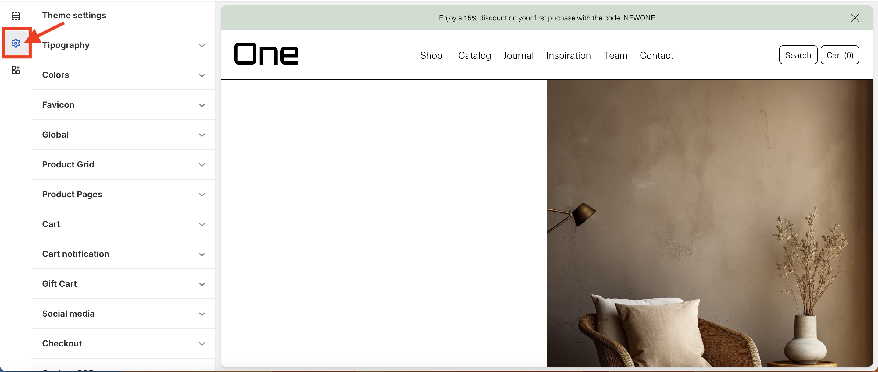
On the other hand, you can also modify specific aspects of the theme. To do this, you need to access the theme settings from Online Store > Themes > Customize.
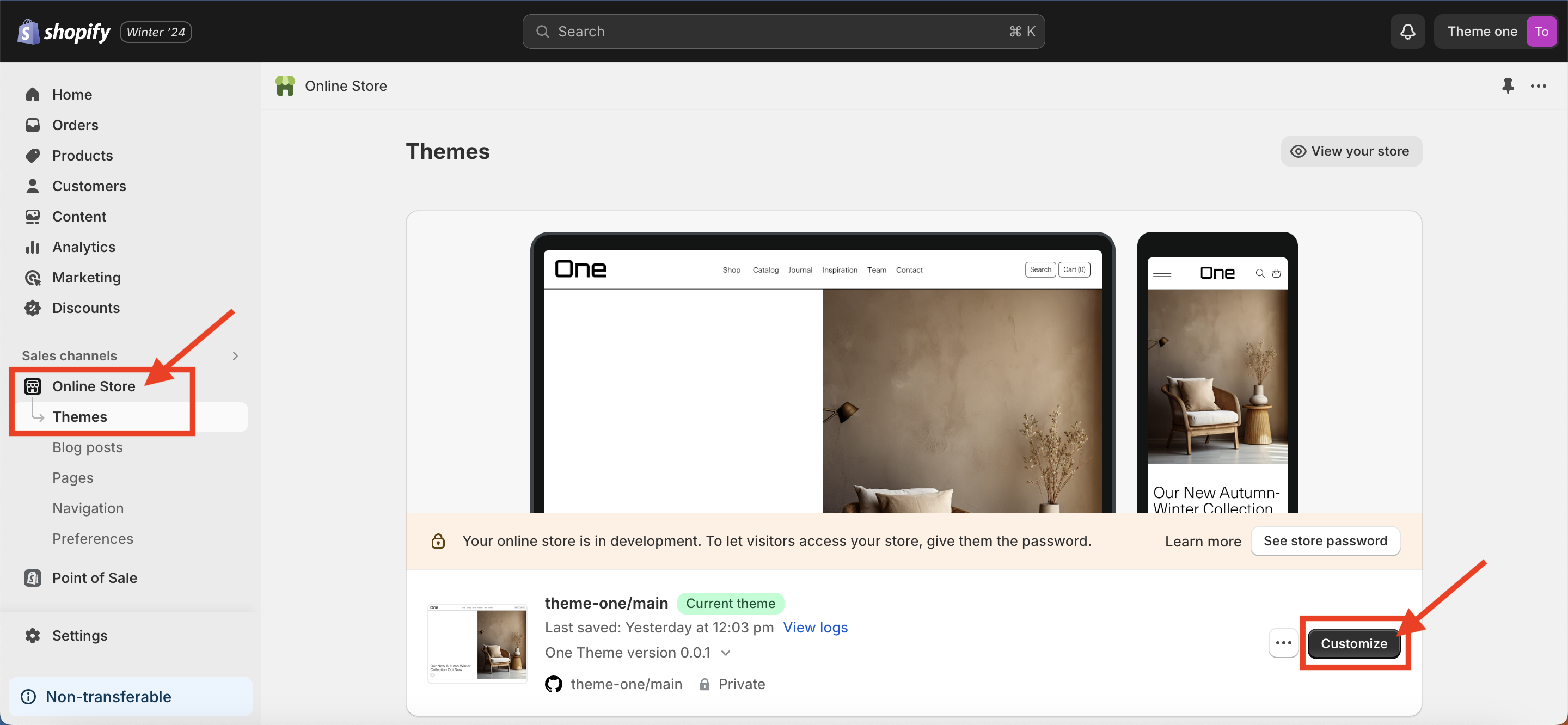
Once inside, you will have to select the second icon in the left column, and there you can change the configuration and style of the theme.
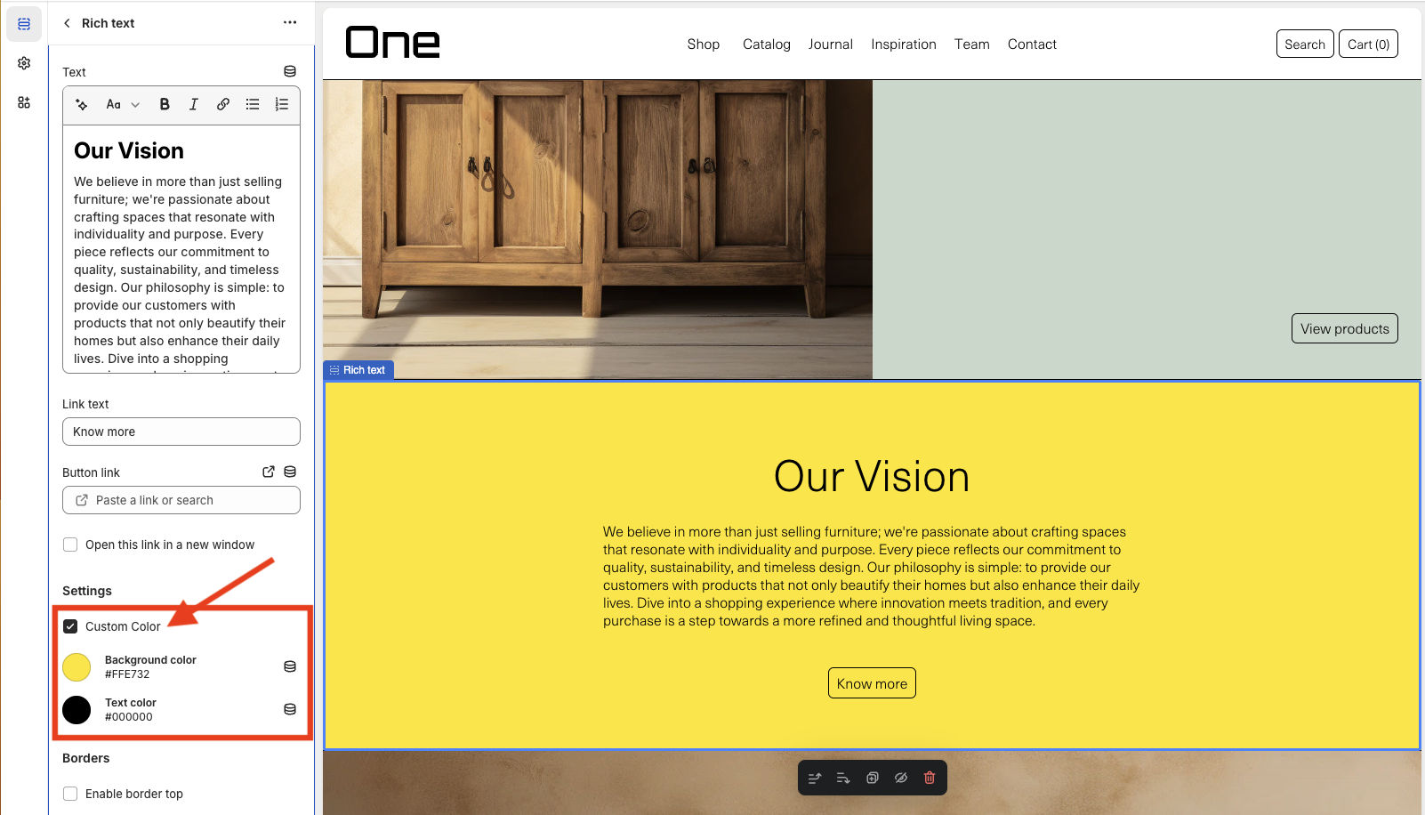
Custom Color
Most sections of the theme also allow changing their background and text color. It’s as simple as checking Custom Color and choosing the desired color (using a hexadecimal code or the color picker).
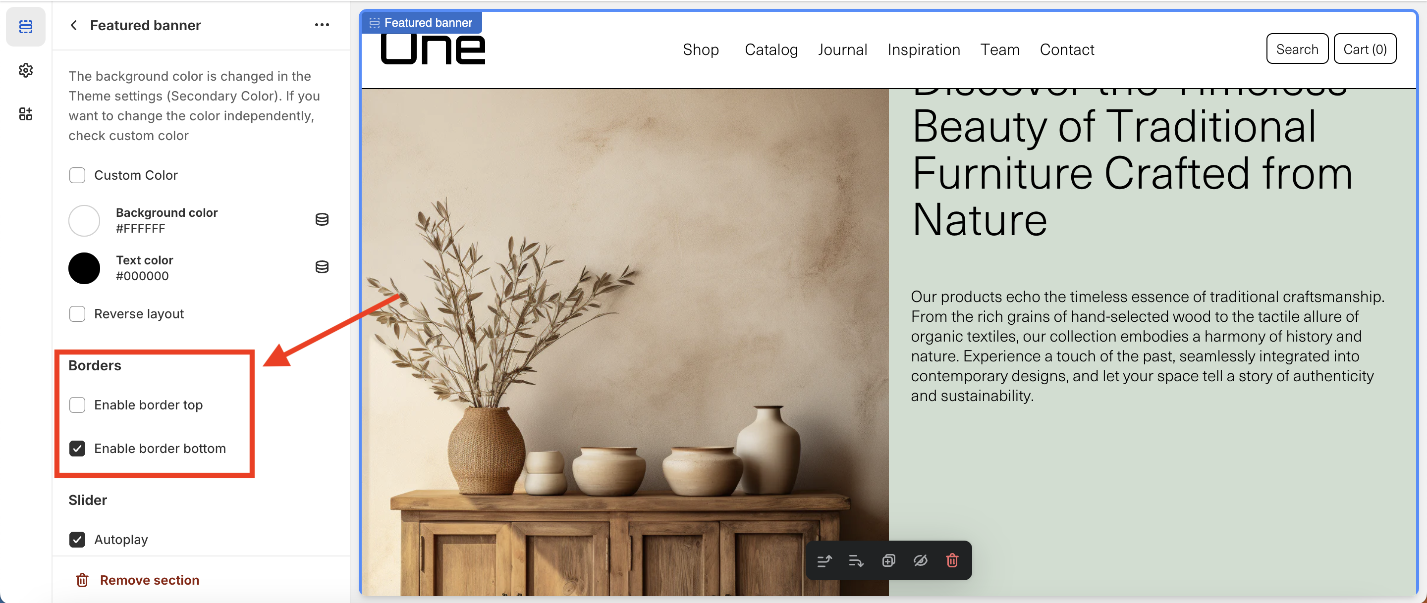
Borders
Almost all sections of the theme allow you to add a top border and/or a bottom border (or not add any at all). This can be done by selecting the desired section and looking for the Borders section in the sidebar.
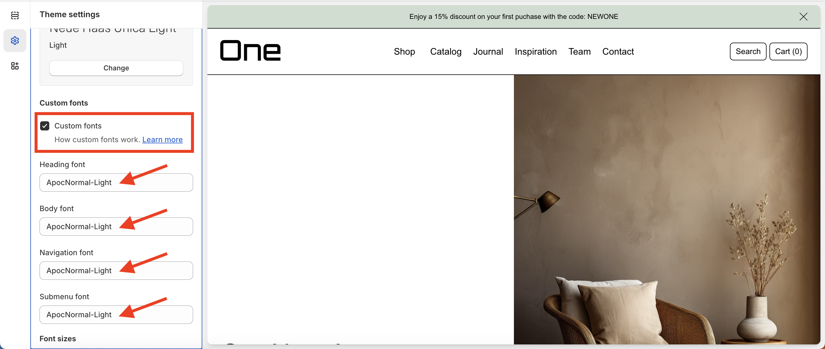
Custom Fonts
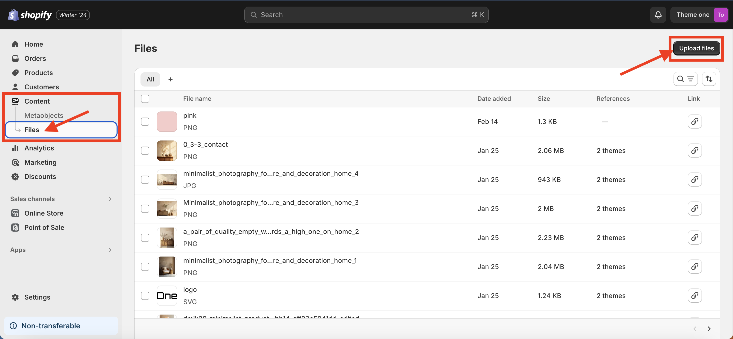
The One allows you to add your custom fonts. To acomplish this, you will first need to have the font in WOFF and WOFF2 format. Once you get your fonts you’ll have to upload it to your Shopify site. Here’s a step by step on how to do it:
1. Upload the WOFF and WOFF2 files to Content > Files
2. Go to Theme settings > Typography
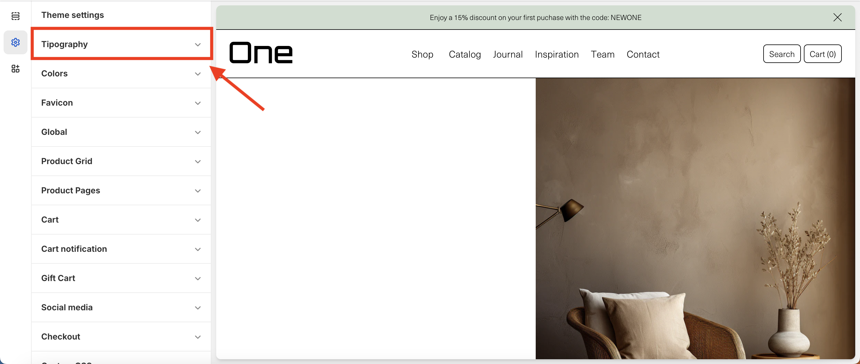
3. Here, check Custom fonts and set the same name as the uploaded WOFF files (we’ve used ApocNormal-Light for this example)
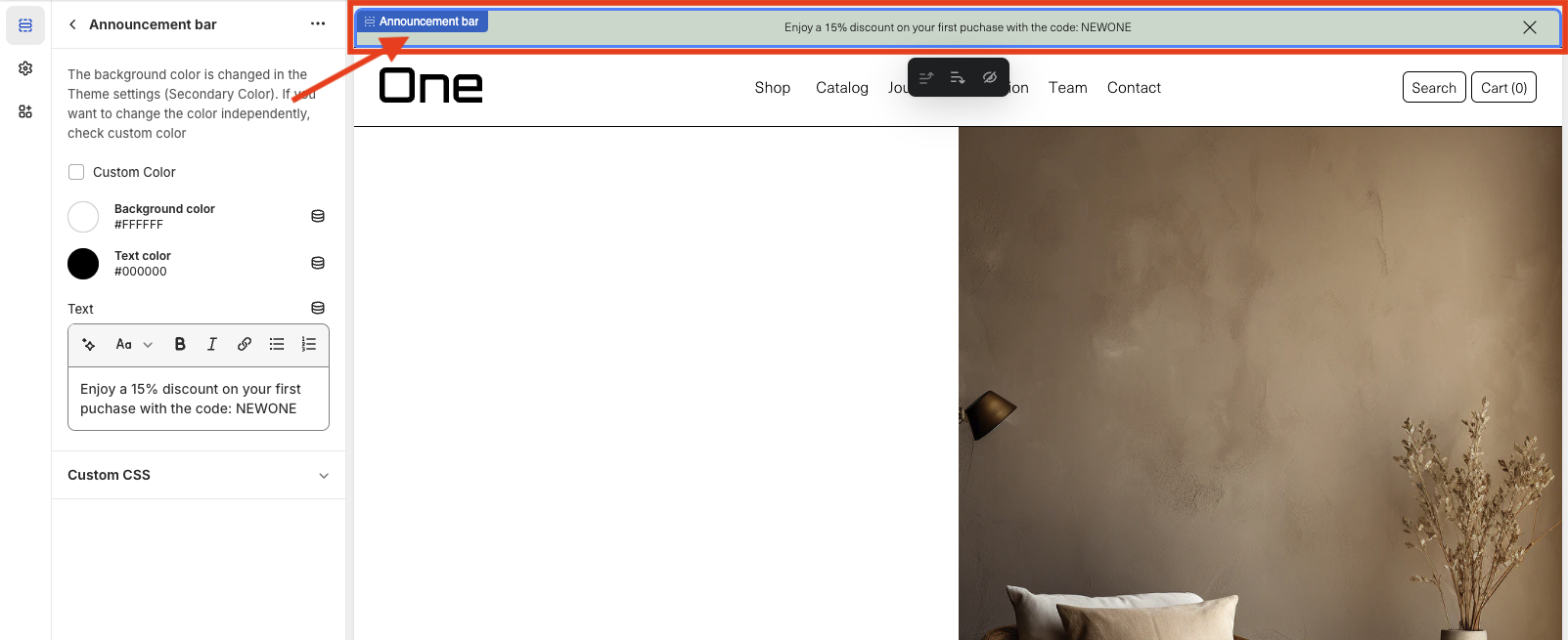
Header Group
The Header Group is composed primarily of two parts: the announcement bar and the header itself. They can be found at the very top of the page.
Announcement bar
The announcement bar is an optional element that appears at the top of every page and includes custom messages with optional links. It’s perfect for promoting sales or need-to-know updates.
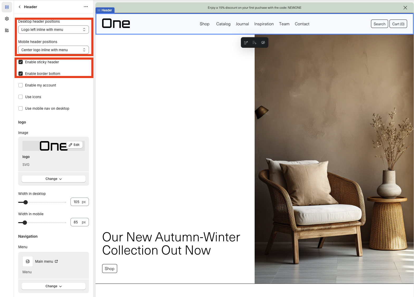
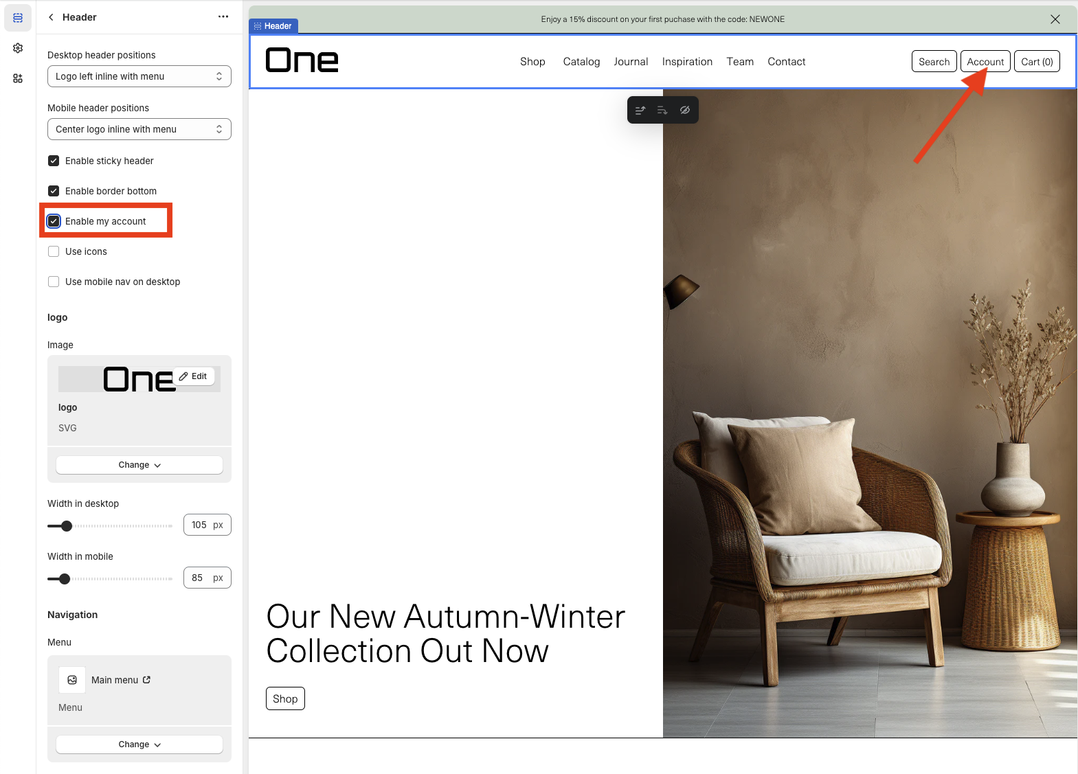
Header
The Header can be customized in various ways:
1. The logo’s position can be modified on both desktop and mobile screens.
2. It can be fixed always at the top of the page > Enable sticky header.
3. A bottom border can be added > Enable bottom border.
4. The Account button can be added next to the search and basket buttons > Enable my account.
5. Icons can be used instead of words for search, basket, and account > Use icons.
6. The hamburger menu can be applied on desktop screens > Use mobile nav on desktop.

7. The logo image can be modified or changed.
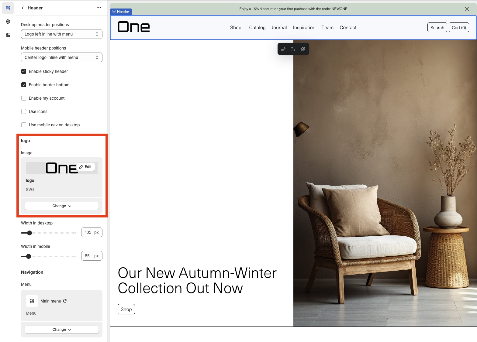
8. The width in pixels can be modified on both desktop and mobile screens.
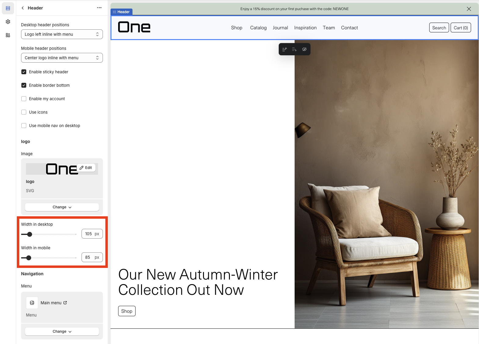
9. The menu to be displayed can be changed.
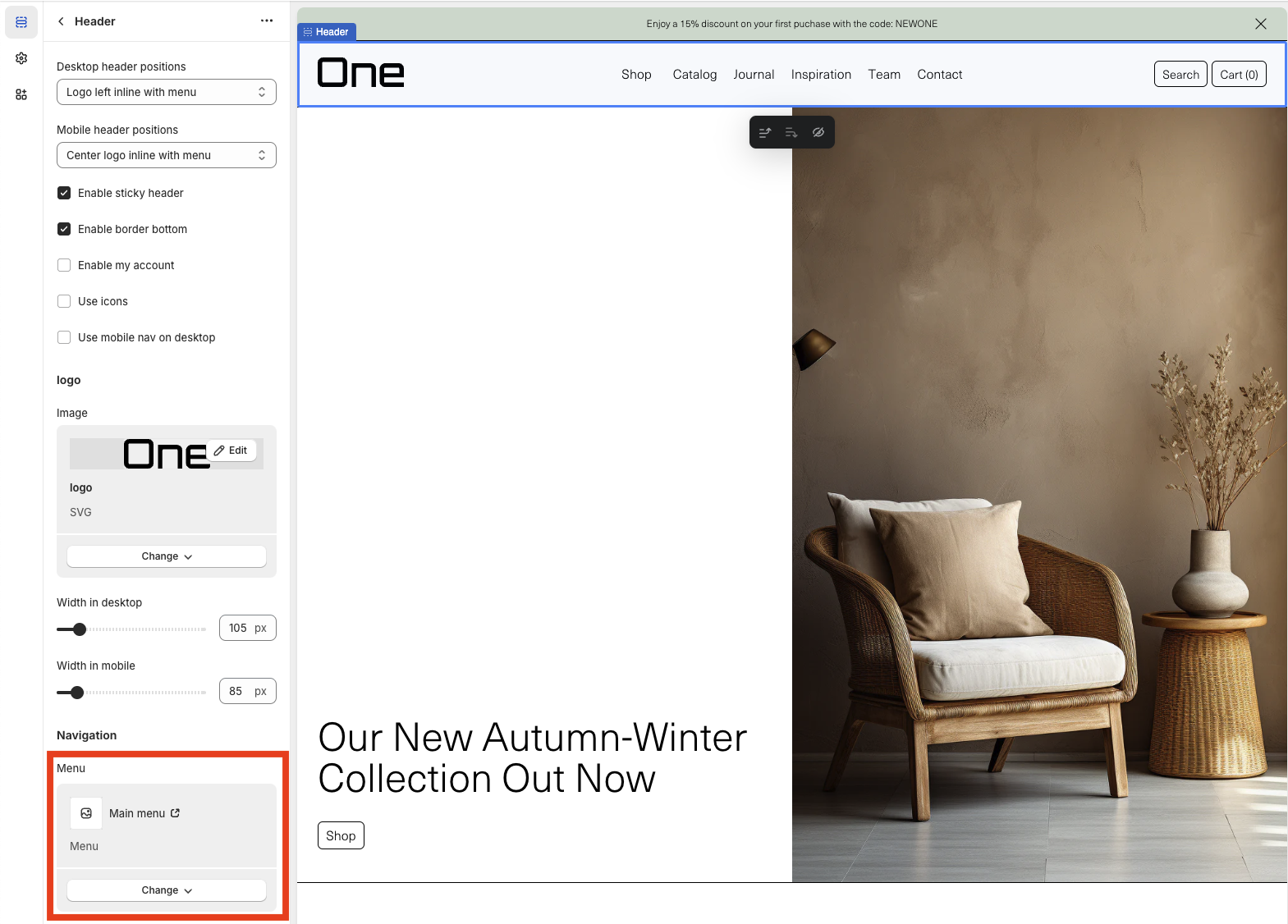
Remember, you can create a menu by navigating to Online Store > Navigation > Menus in your dashboard.
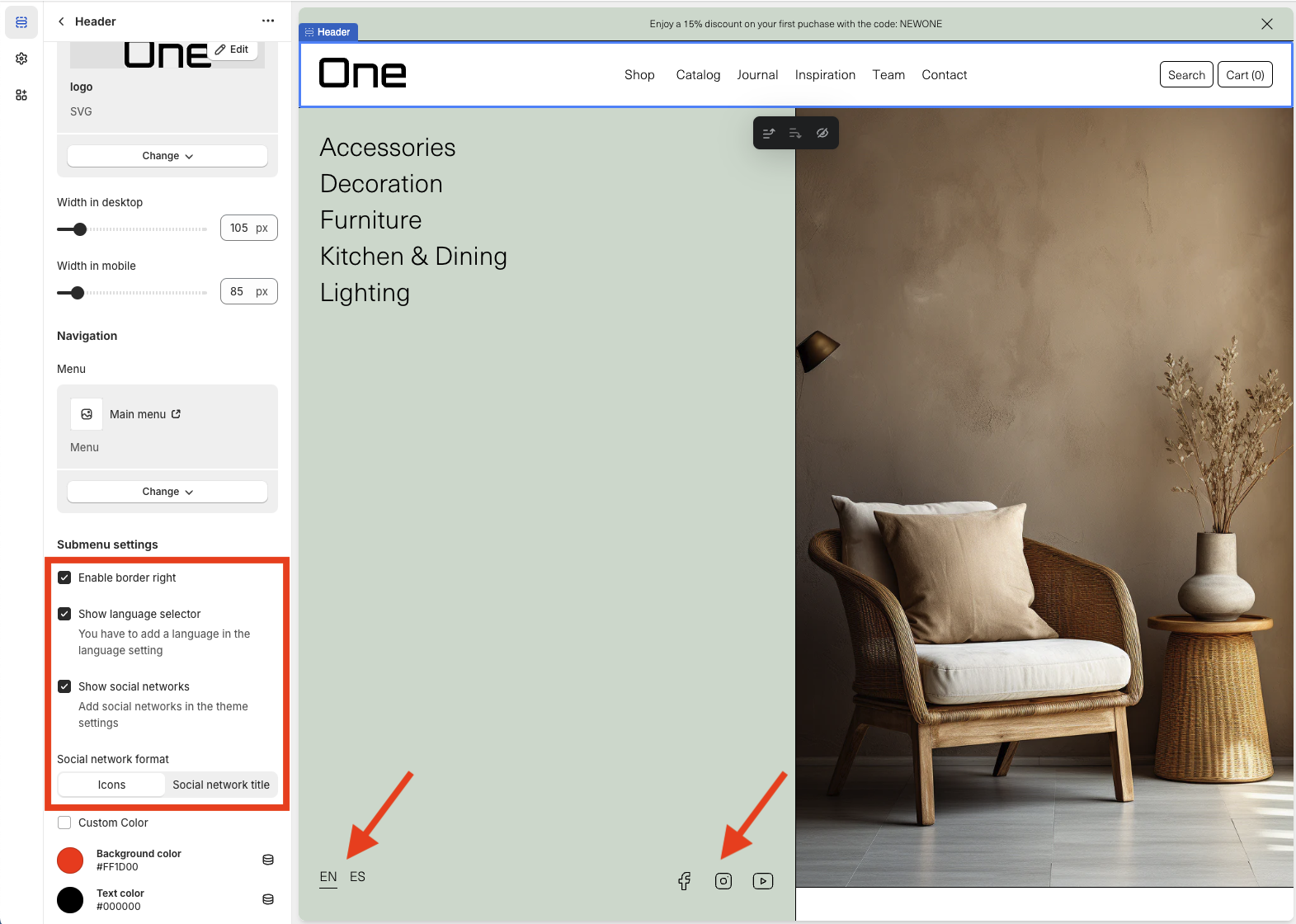
10. A right border can be added to the submenu (in this example available in the Shop section of the main menu) > Enable right border.
11. The language selector can be displayed in the submenu > Show language selector.
12. Social networks can be displayed in the submenu > Show social networks.
13. It can be chosen if the social networks in the submenu appear in icon format or by their title.
14. A custom background and text color can be chosen > Custom Color.
Footer Group
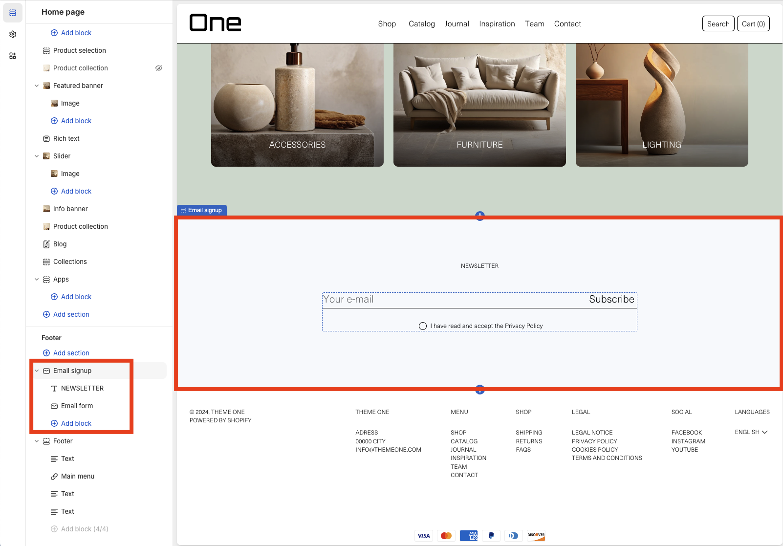
The Footer Group is composed of two parts: the email signup and the footer itself.
Email Signup
With the the Email Signup section you can add a form for users to signup to your newsletter. You can also modify its title and subtitle. (There’s no subtitle in this example)
Footer
The Footer section can be modified in the following way:
1. A top border can be added > Enable top border.
2. A bottom border can be added > Enable bottom border.
3. The text can be transformed to uppercase > Text uppercase.
4. Payment methods can be displayed > Show payment icons.
5. Social networks can be displayed > Show social networks.
6. It can be chosen whether social networks appear in icon format or by their title.
7. The language selector can be displayed > Enable language selector.
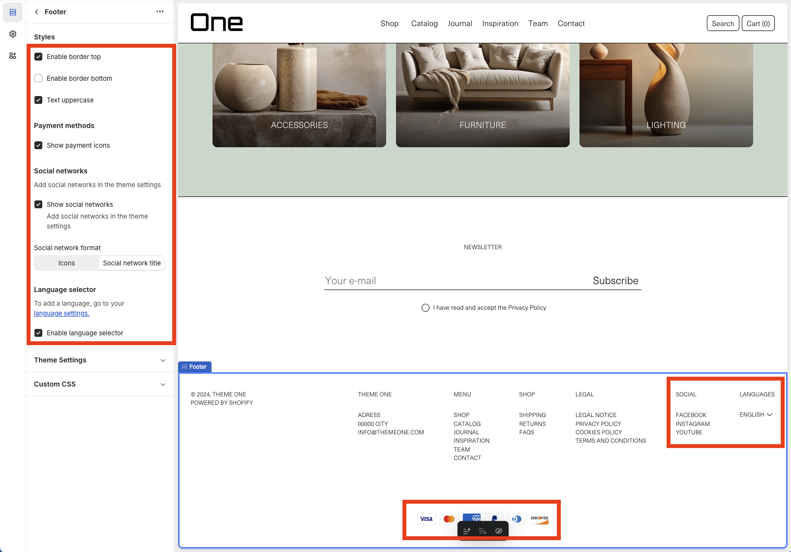
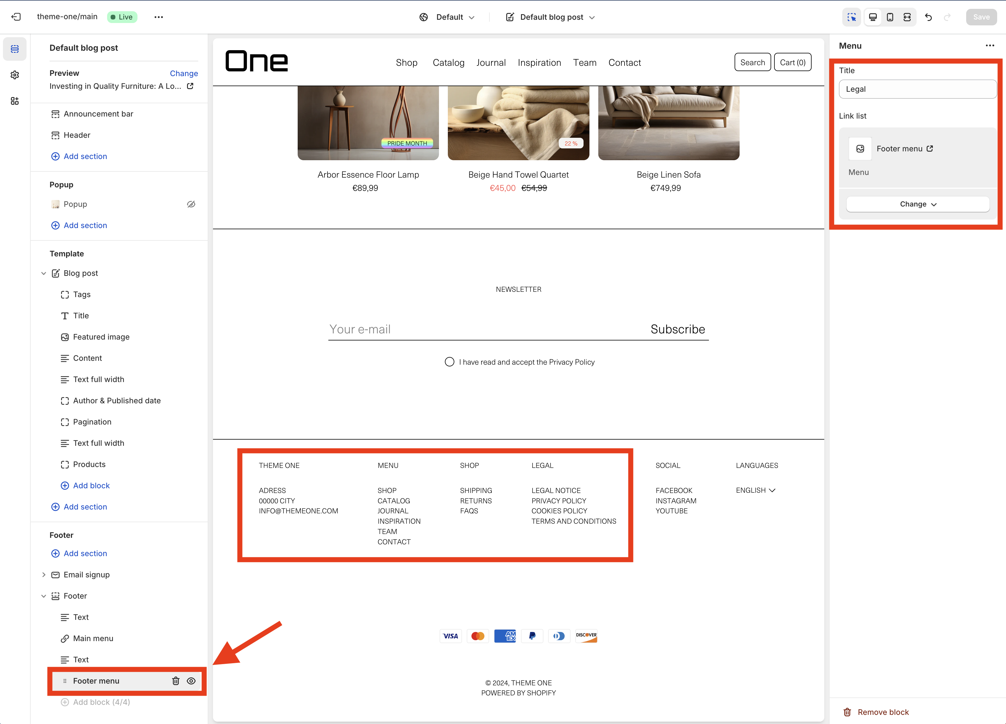
Within the Footer, you can have up to four blocks, which can be either text or links with menus. In this example, there are two text blocks and two menus (Main Menu and Footer Menu). You can select which menu to display in each block through the sidebar options.
Sections
The body of the different pages in your shop can include various types of sections, each with its own customizable features. Below, we’ll go through each of these sections individually to explore how they can be tailored to your needs.
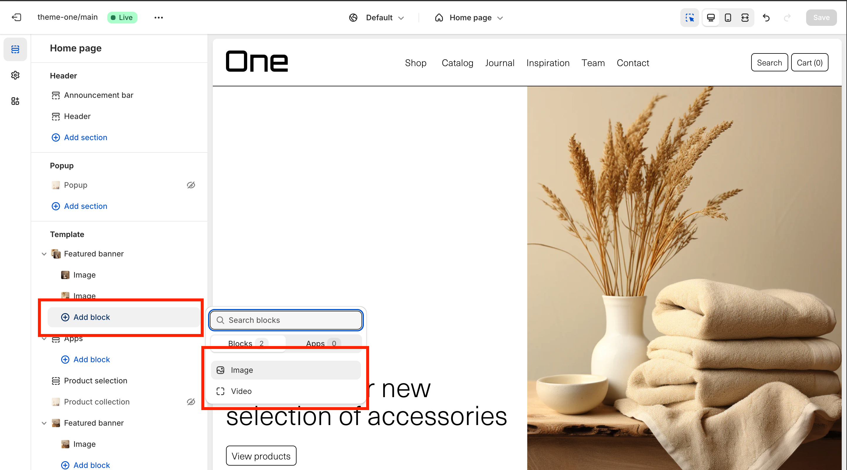
Featured Banner
The Featured Banner section allows you to add various highlights to the page in with a slider.
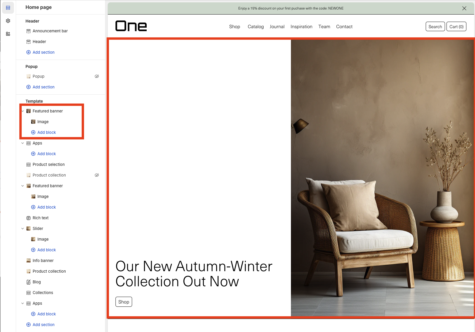
There’s various options for the slider’s settings:
- The autoplay can be enabled/disabled
- The transition effect can be set to fade. (Default will be a slide effect)
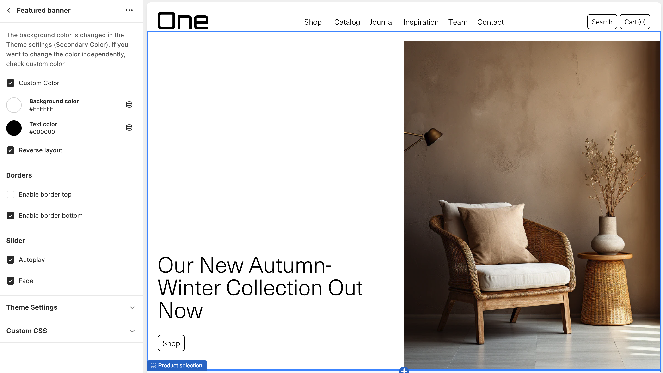
To add a slide you can click ‘Add block’, here you’ll have to choose if you want a video or image.
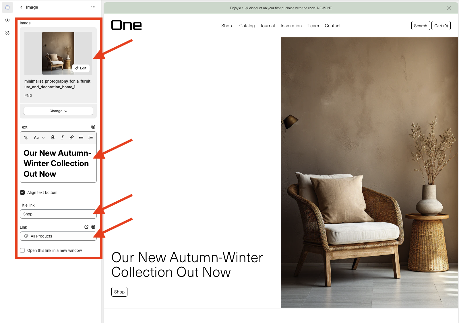
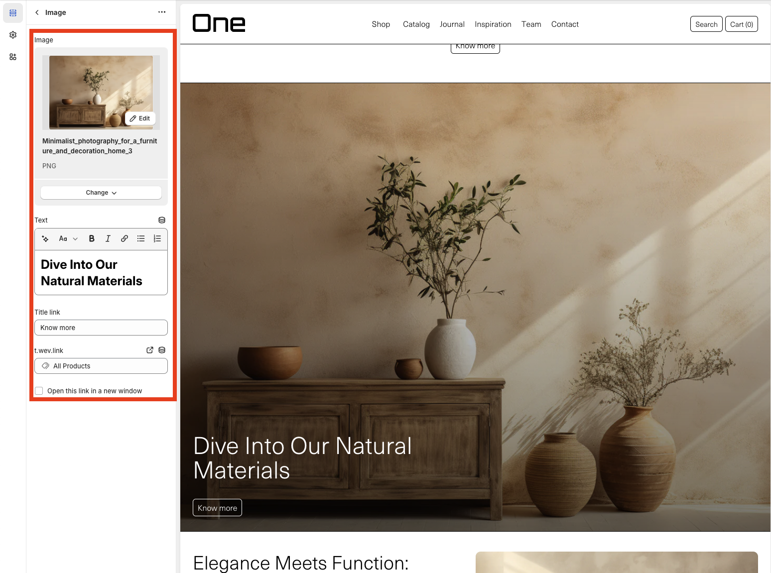
The individual slides also feature some settings. You can set the Image or video, the title and its position and finally, a button with a custom link.
Info Banner
The Info Banner is a section that, similar to the Featured Banner, allows you to combine an image and/or video with text and a link. Its inner sections are:
1. Text: where you can write the desired title and content.
2. Image Or Video: where you must select either an image or a video.
3. Title link and Link: where the title and the relevant link are added.
4. Reverse Layout: allows arranging the elements in reverse, that is, the text and the link on the right and the image or video on the left.

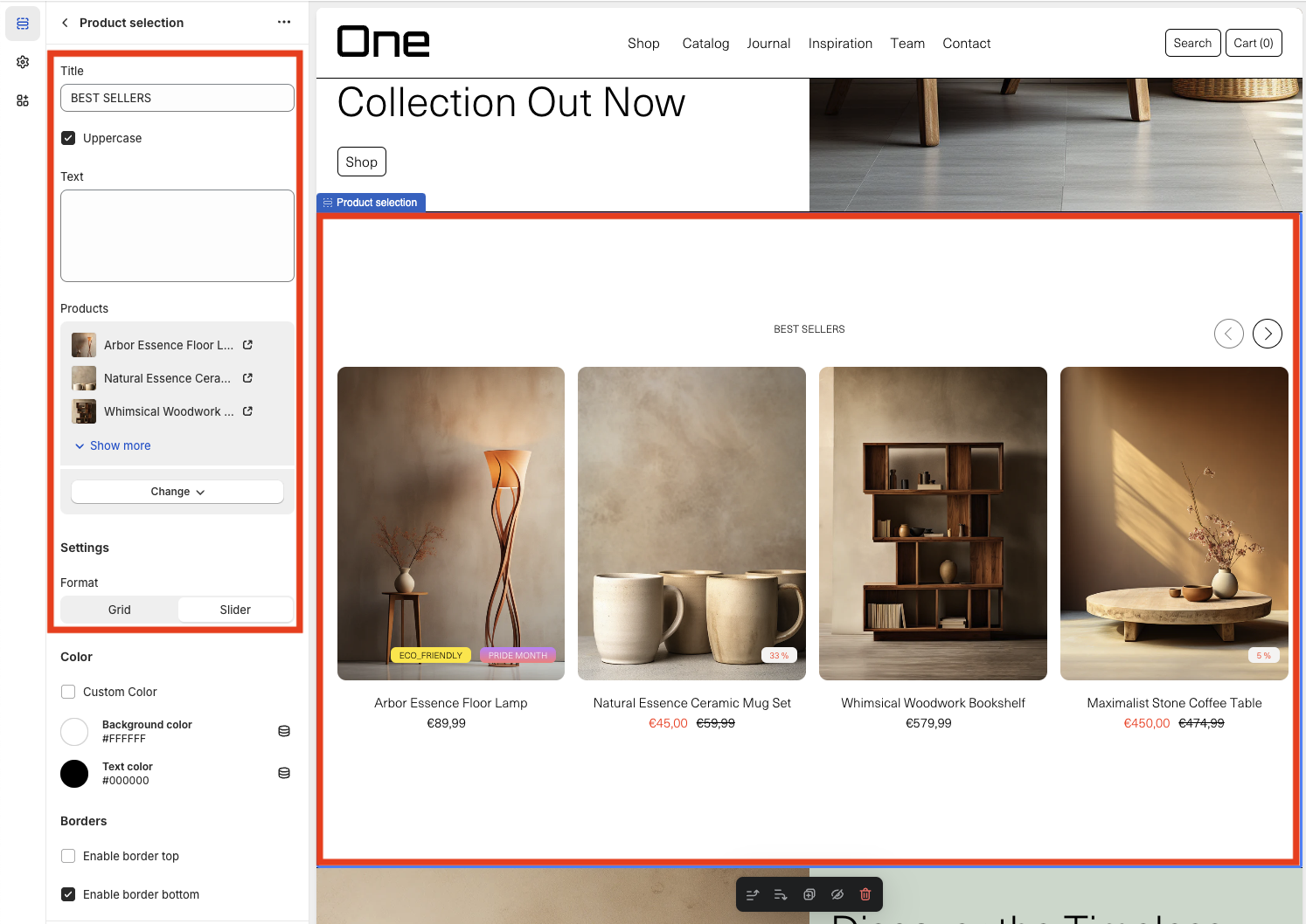
Product Selection
With the Product Selection you can display a collection of available products. The sections that make it up are:
1. Title: in this example, “BEST SELLERS”
2. Text: in this example, it has not been added
3. Products: which can be added either in their entirety or just a selection
4. Format: which allows the products to be displayed either as a slider, like in this example, or as a grid
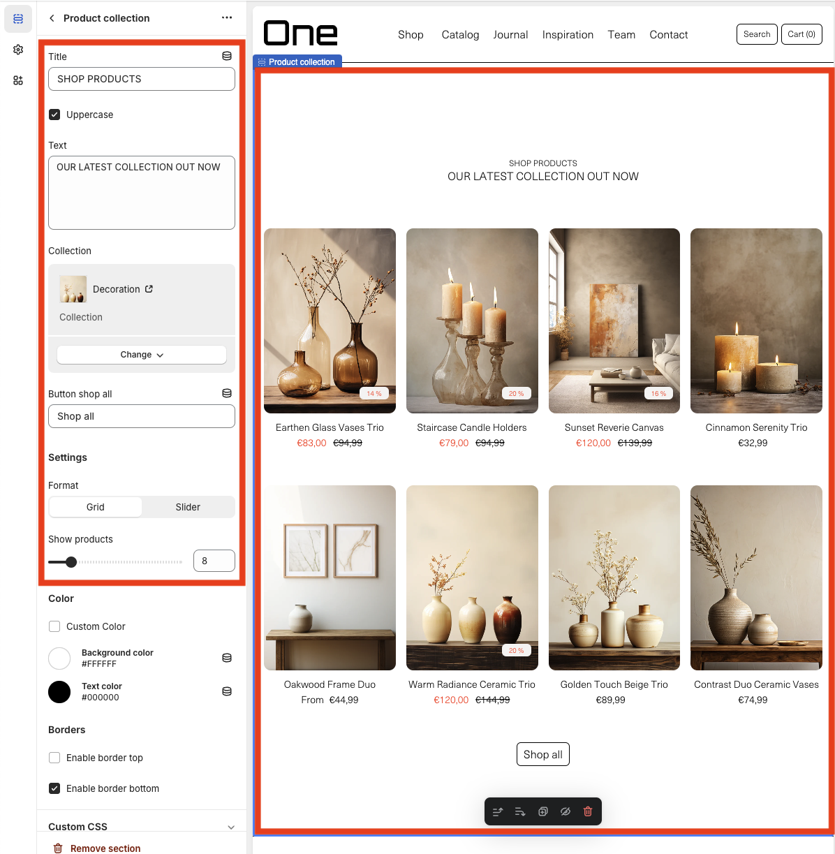
Product Collection
Similar to the Product Selection, the Product Collection allows you to display the products of a specific collection. Its internal sections are:
1. Title: in this example, “SHOP PRODUCTS”
2. Text: in this example, “OUR LATEST COLLECTION OUT NOW”
3. Collection: which allows you to choose the collection to display
4. Button shop all: that links to the collection page
5. Format: which allows you to choose whether the display is with a grid, as in the example, or with a slider
6. Show products: which allows you to choose the number of products to display
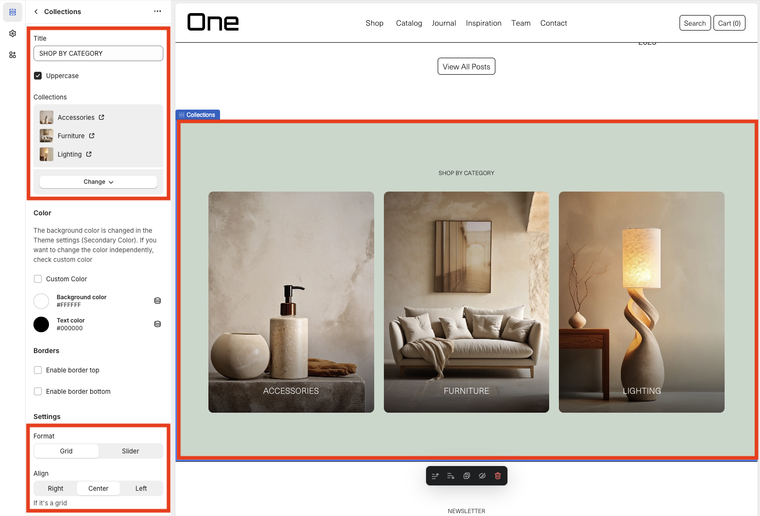
Collections
The Collections section allows you to display the various product collections. Its internal sections are:
1. Title: in this example, “SHOP BY CATEGORY”
2. Collections: which allows you to display all collections or only a selection
3. Format: which can be in a grid version, as in the example, or in a slider version
4. Align: if the grid format is chosen, you can select the alignment
Slider
The Slider allows you to display a collection of images and/or videos. It can be configured so that the different images or videos play automatically > Autoplay, and also that the transition be of a fade type > Fade. You can also choose the vertical and horizontal alignment of the text.
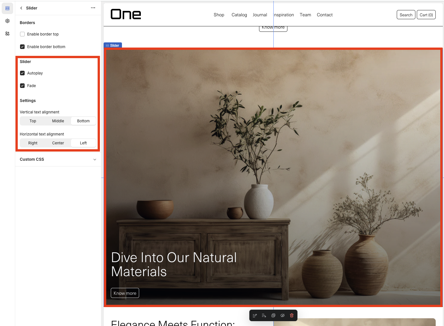
Each image or video allows adding its own custom text and link.
Rich Text
The Rich Text is a section that allows you to display a text and a customized link.

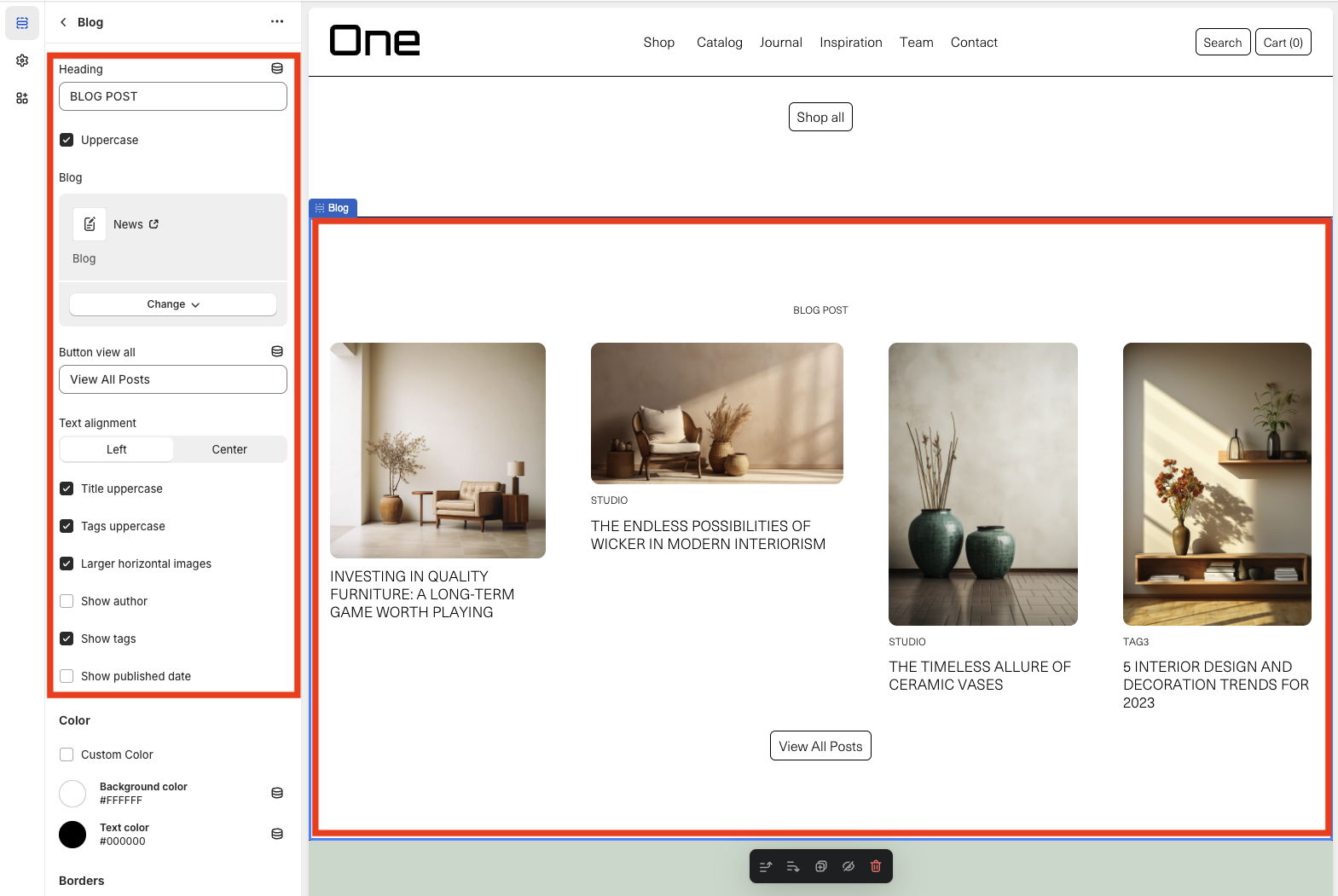
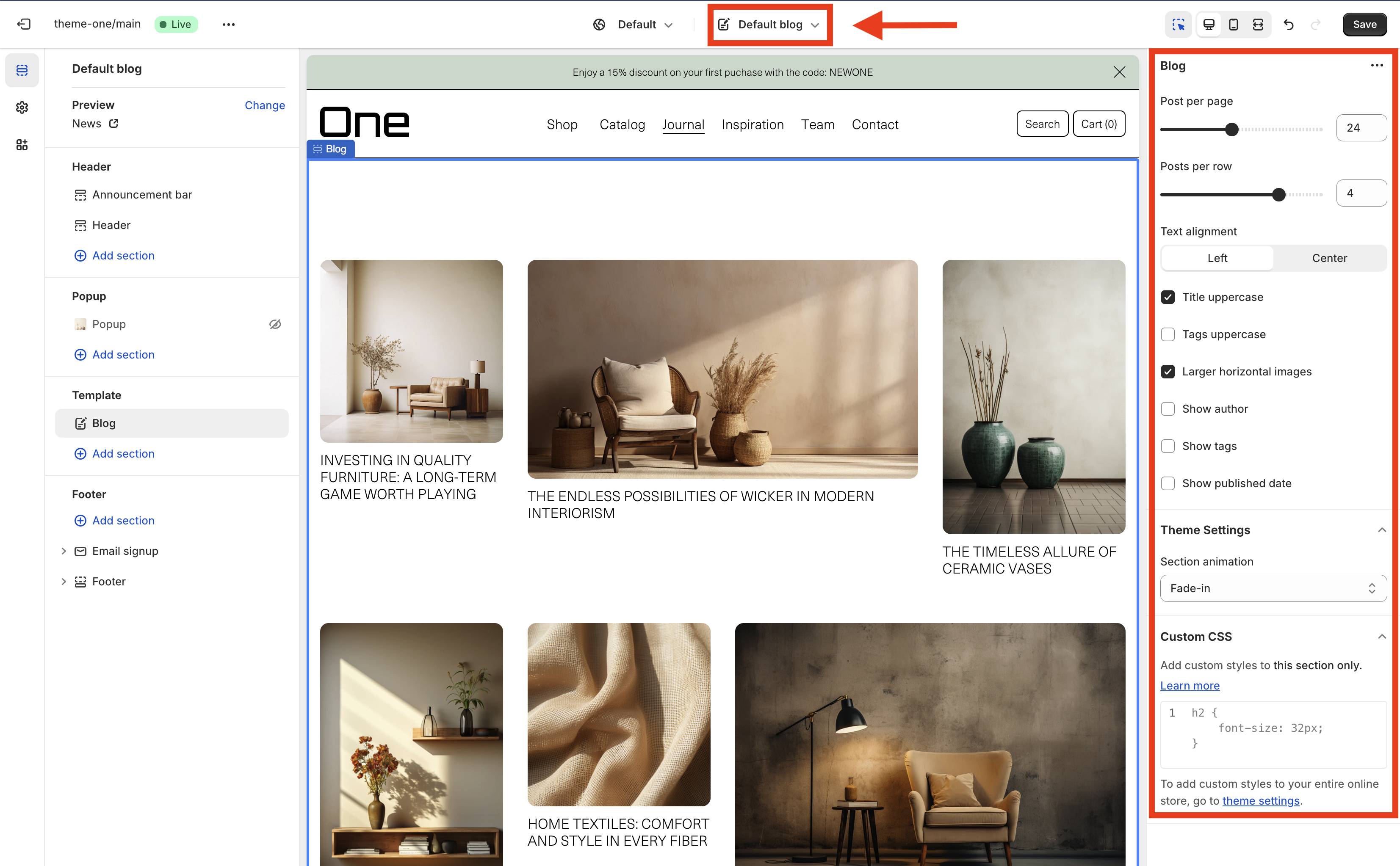
Blog
The Blog section displays a collection of posts from a specific category. It can be modified as follows:
1. Heading: in this example, “BLOG POST”
2. Uppercase: which allows transforming the Heading into uppercase
3. Blog: which allows choosing the category of posts you want to display, in this case, “News”
4. Button view all: which links to the page with all the posts from that category
5. Text alignment: which allows choosing the text alignment
6. Title uppercase: which allows transforming the post titles into uppercase
7. Tags uppercase: which allows transforming the tags into uppercase
8. Larger horizontal images: which allows enlarging the size of the horizontal images
9. Show author: which allows displaying the author of the post
10. Show tags: which allows displaying the tags of each post
11. Show published date: which allows displaying the publication date of each post
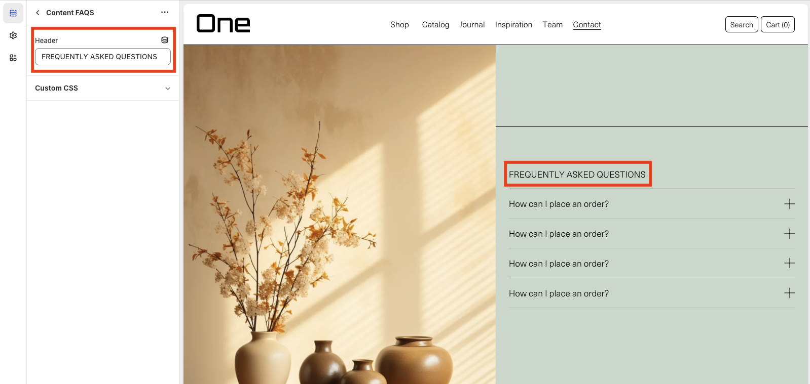
FAQS
The FAQ section adds questions and answers that may be useful for users.
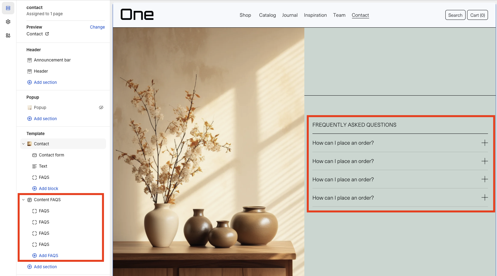
From the Content FAQs, you can change the title of this section. In this example, it is “FREQUENTLY ASKED QUESTIONS”.
Each question allows choosing a title and a text with the answer, which is displayed by clicking on the “+” symbol.

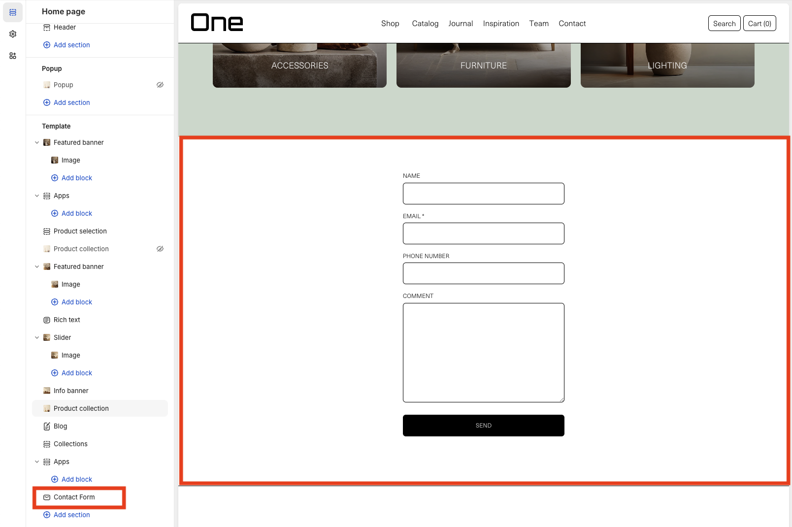
Contact Form
The Contact Form section creates a default contact form with five inner sections:
1. Name
2. Email* (required)
3. Phone number
4. Comment
5. Send button
Email Signup
The Email Signup section adds a form in which the user can enter their email to receive the Newsletter. In addition to the form, a title can be added (in this example, “NEWSLETTER”) and a subtitle (in this example, none has been added). The acceptance text can be modified by selecting the Email form section. By checking “Show acceptance text” the check appears. The text must be added manually.

Templates
Here you can find details about different types of templates available in your theme. To switch the page template, click on the selector at the top center of the page.
Product
Single product pages are tailored for each product and include various configurable aspects. Below, you’ll find these aspects and instructions on how to customize them.
Variant Swatches
Your theme allows you to display product variants like:
- Color
- Size
- Material
- Style
- …
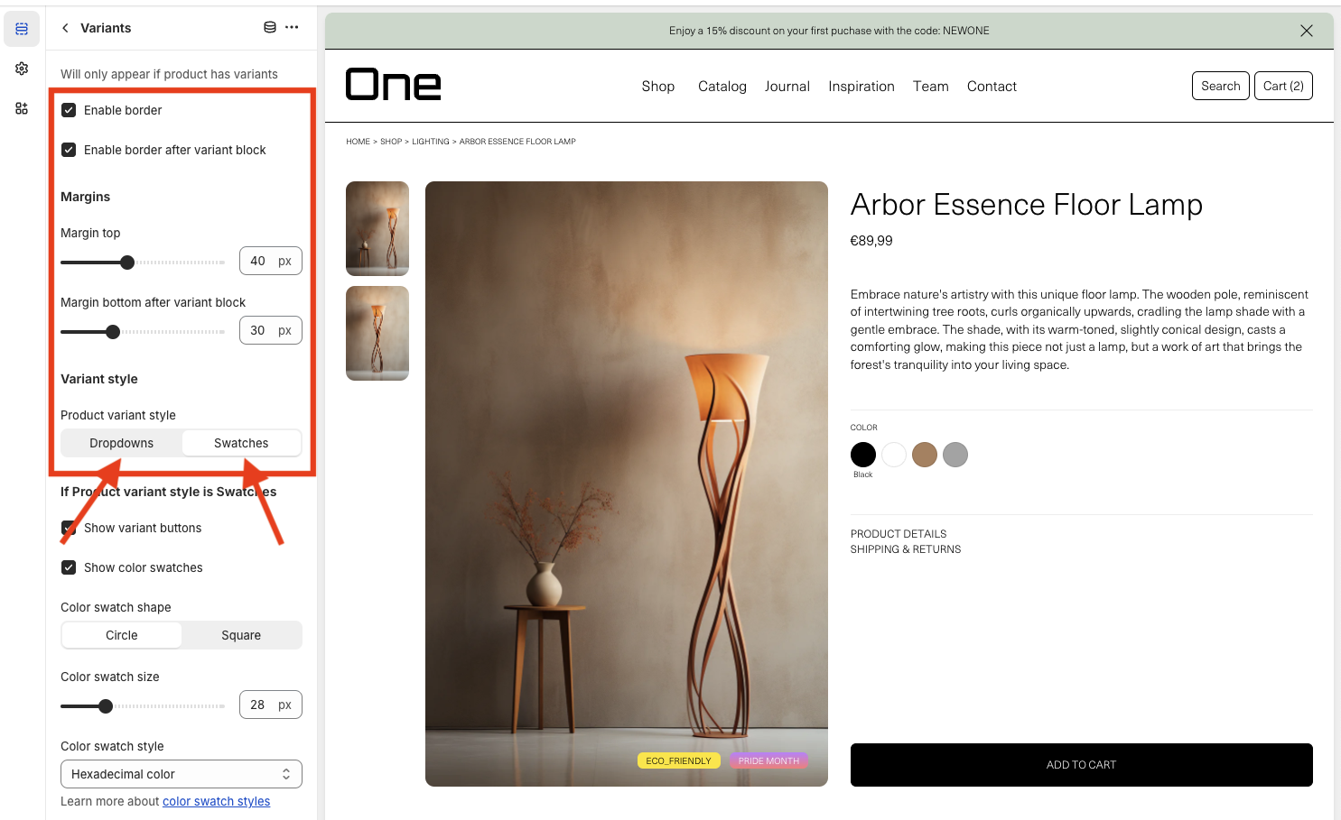
You can customize the aspect of the variants selector displayed at the product page in the theme editor at Template > Product > Variants:
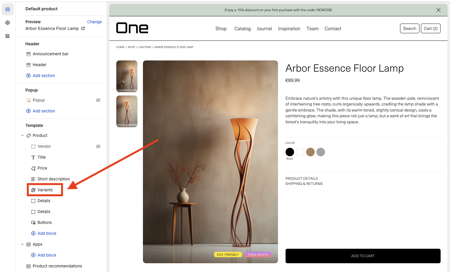
And there you can add borders, margins and choose between two selector styles: Dropdowns or Swatches.
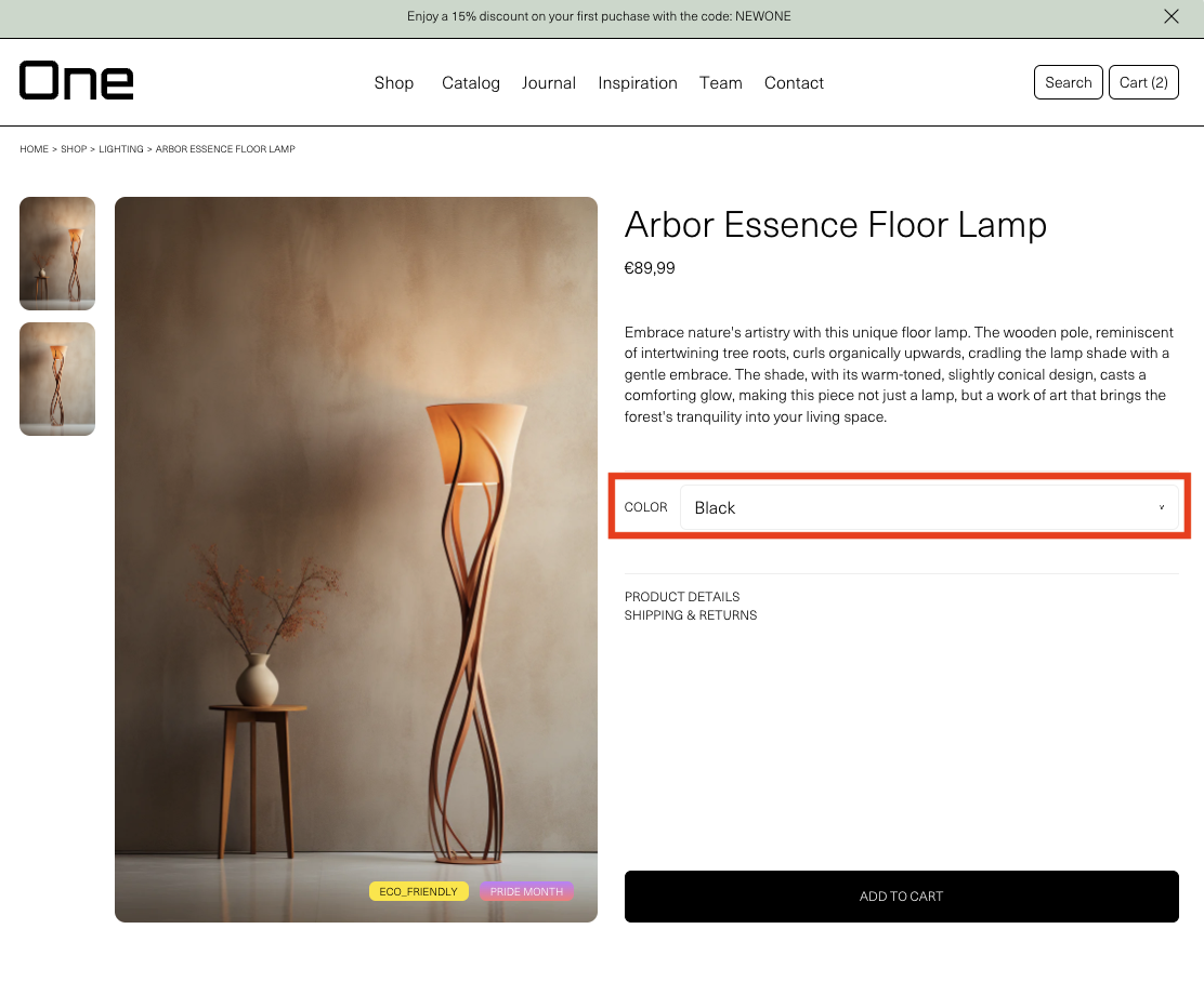
Dropdowns would look like this:
And swatch buttons like this:

If you want to display swatch buttons for color variants there are three ways to achieve it. You can directly add the solid color through a hexadecimal code, you can upload a custom image of it or you can choose one of the product images.
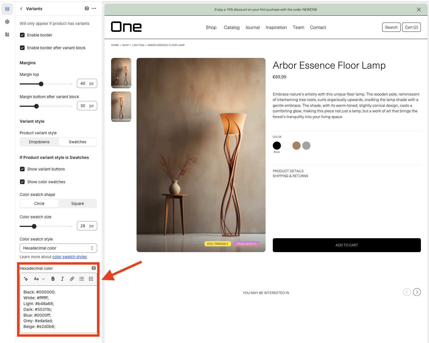
Color variants with hexadecimal code
In the theme editor at Template > Product > Variants you must check the Show color swatches option and set the Color swatch style selector to Hexadecimal color.
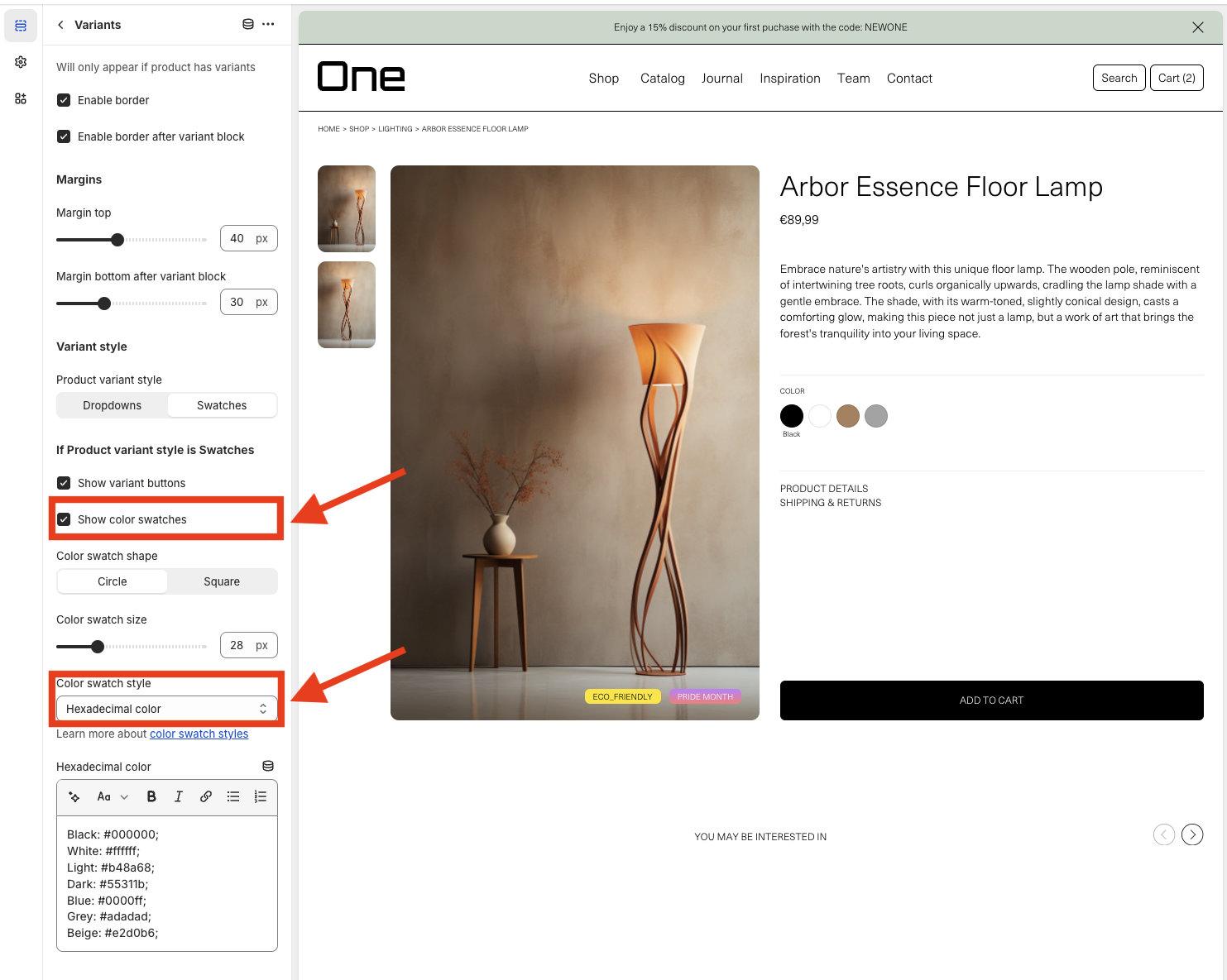
Then, at the Hexadecimal color text box you can add as many colors as you want.
You must understand that you are just defining them, later these will need to be assigned to each product depending on its color variant options. We will talk about it later, don’t worry.
As you can see, you must define colors with this format:
Black: #000000;
The first part corresponds with the color name that will be displayed at the product page and the second part is the hexadecimal code for that specific color.
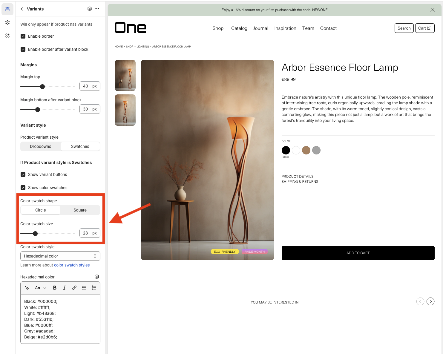
You can also choose the color swatch shape (circle or square) and the color swatch size.
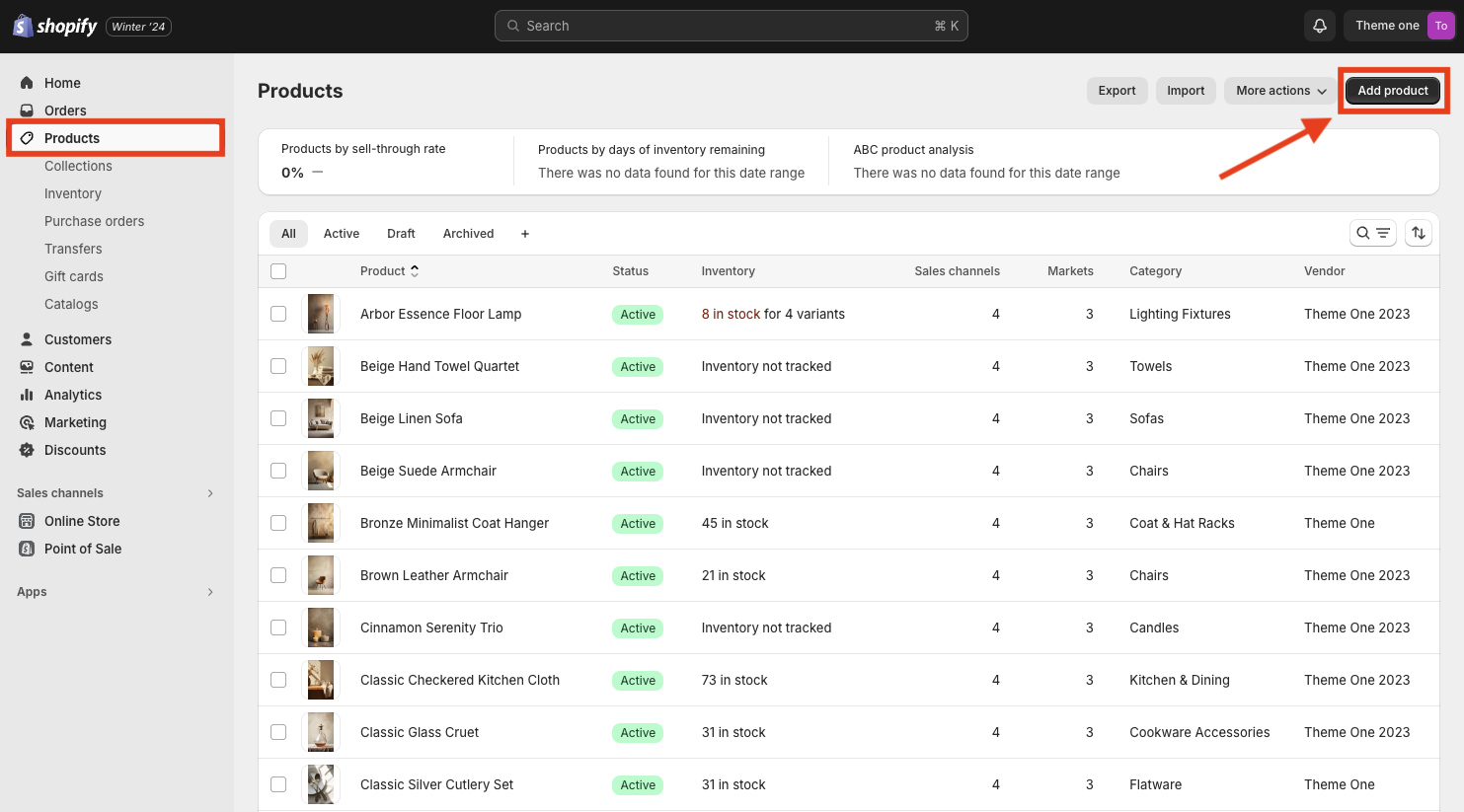
After doing all these changes you must click Save at the top right of the theme editor and go to the Products section.
If you have already created any products you will see these there. If not, you can create a new one by clicking the Add product button at the top right of the page.
Inside the product page you will see different sections like Title, Description, Media… The sixth section is called Variants.
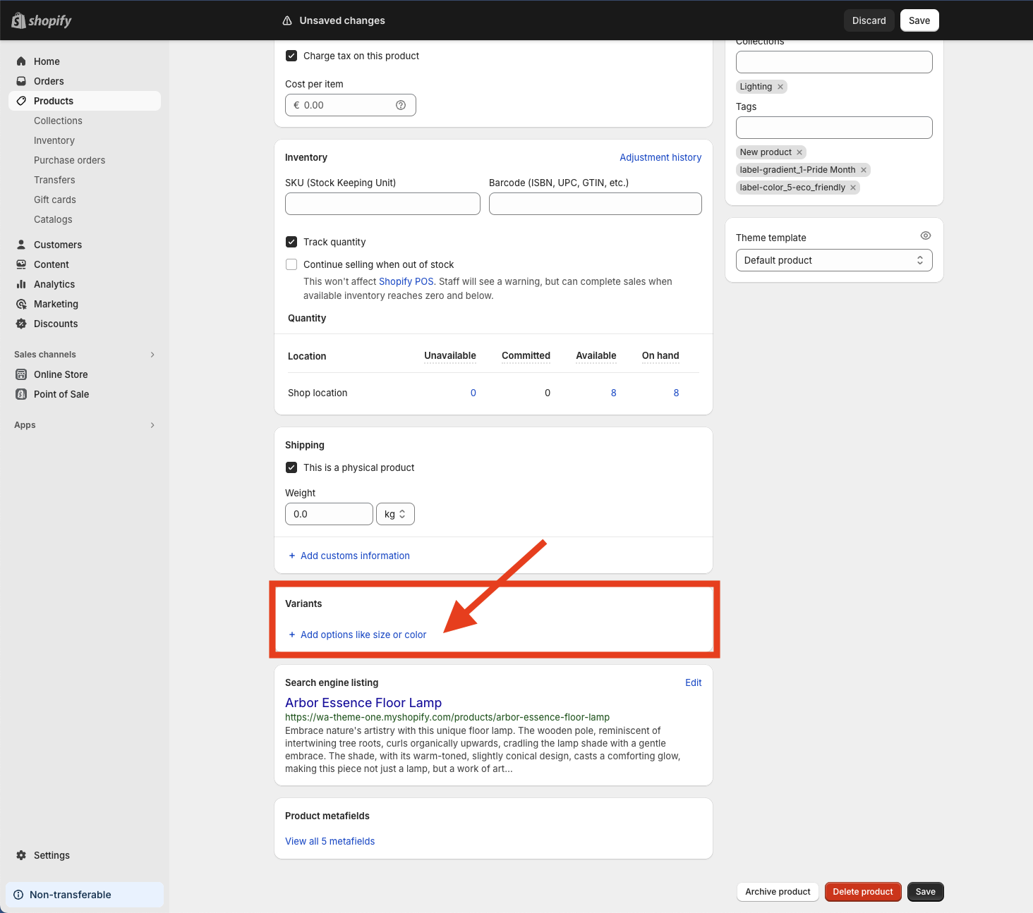
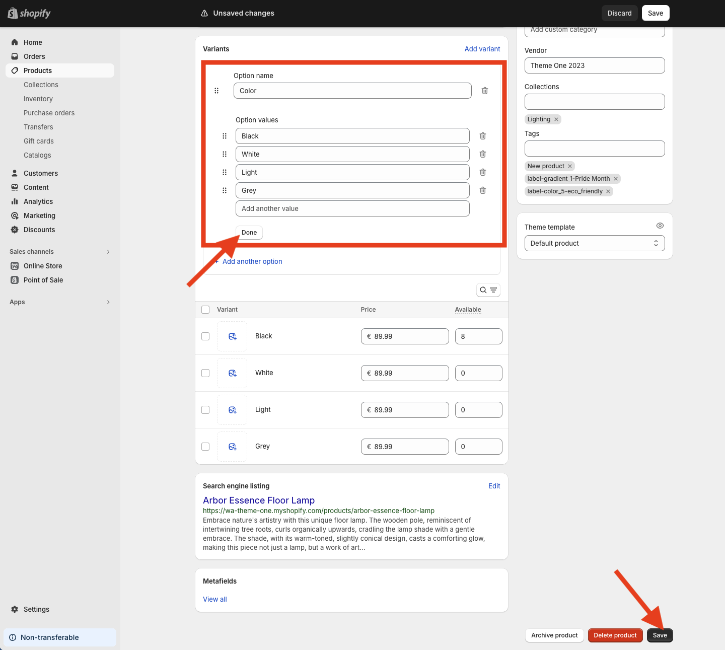
You need to tap + Add options like size or color and then select Color. Then you will be able to add the colors for that product (remember that these must be previously defined inside the Hexadecimal color text box at the theme editor at Template > Product > Variants). Once you finished, you just need to tap Done and finally the Save button at the bottom right of the page.
If you have followed all these steps you will see the result at the product’s page.
Swatch buttons for color variants for a specific product
Previously we defined several colors at the Hexadecimal color text box in the theme editor at Template > Product > Variants. These example colors are:
- Black
- White
- Light
- Dark
- Blue
- Grey
- Beige
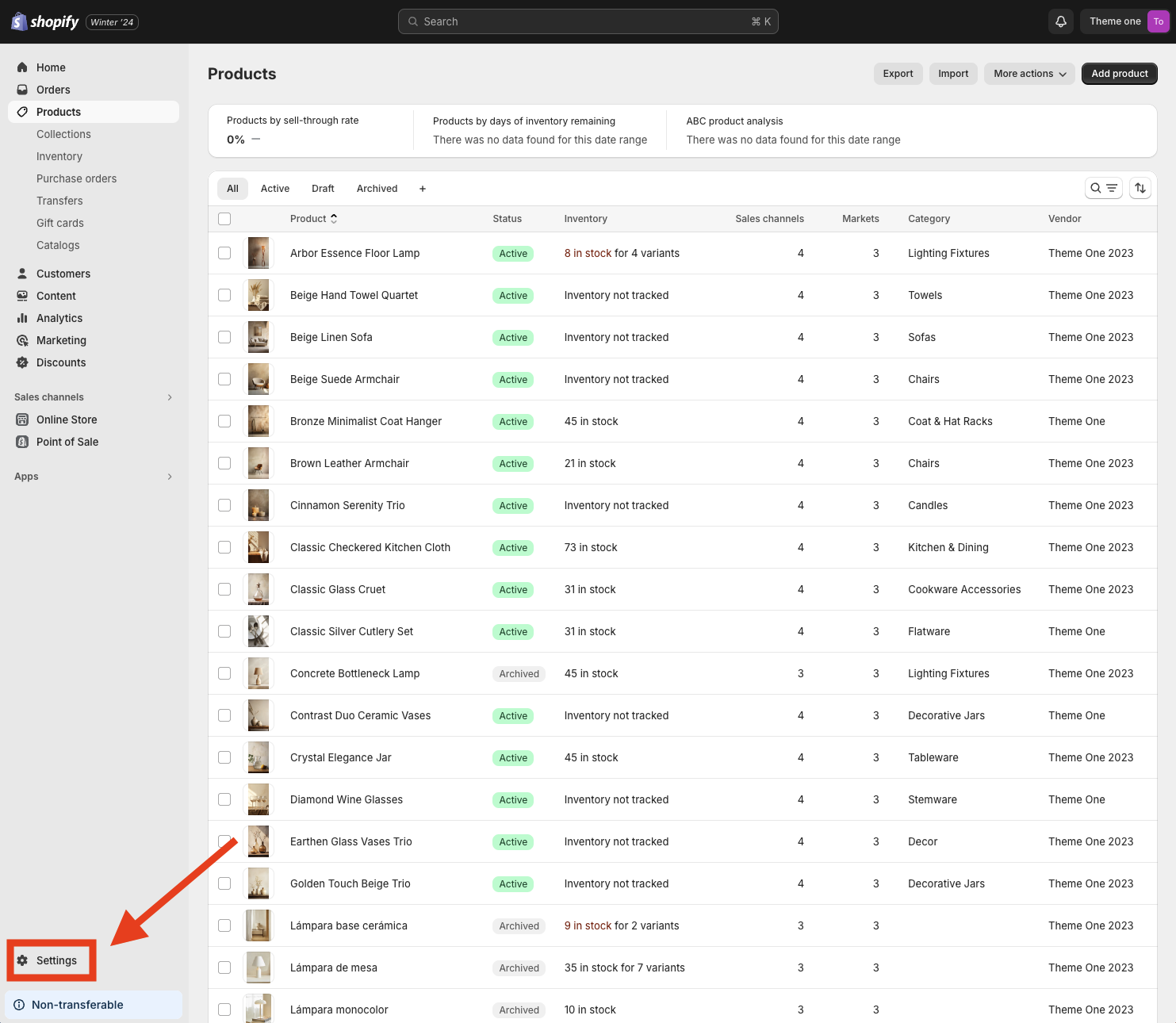
These colors are available for all products and in our example product we added Black, White, Light and Grey. But imagine that we create another product and we want it to have the Light color variant in another color, different from the one that is defined inside the box. We can do it by creating a new metafield for products. To do this, we must go to Settings:
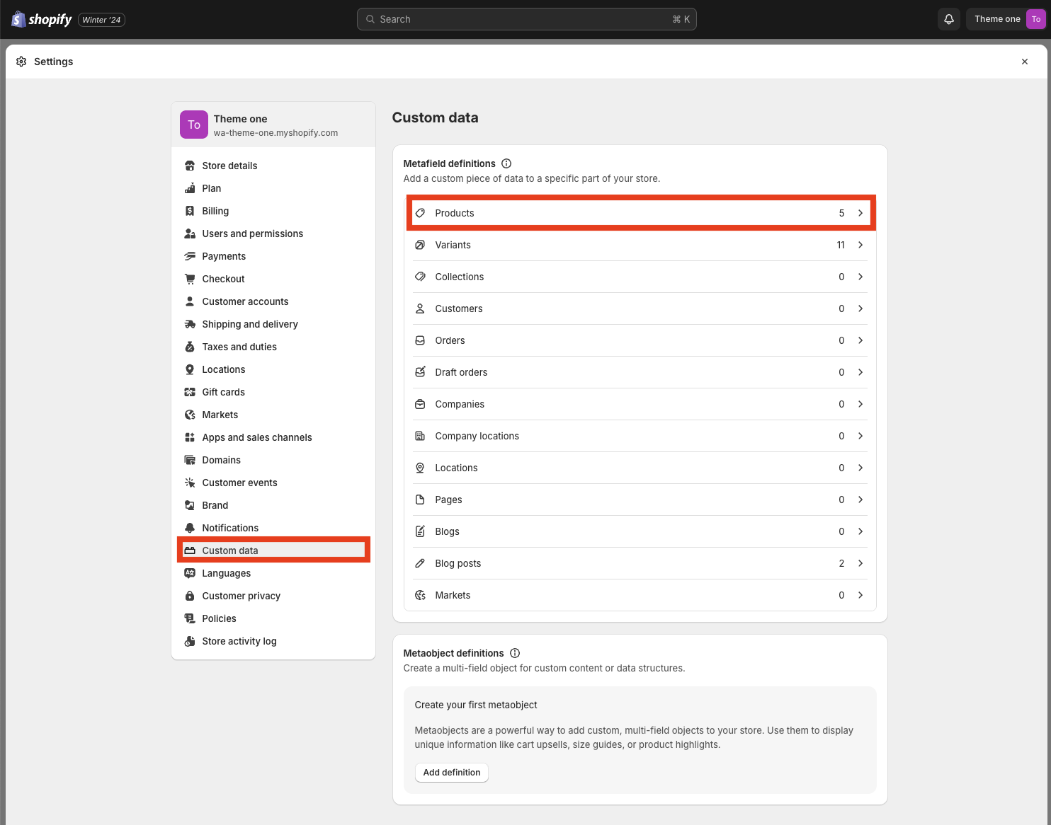
And there go to Custom data > Products:
And tap the Add definition button:
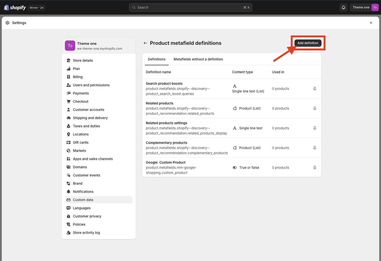
Once you have done this you need to give a name to the metafield, for example Specific Color Variant, and Select type Single line text.
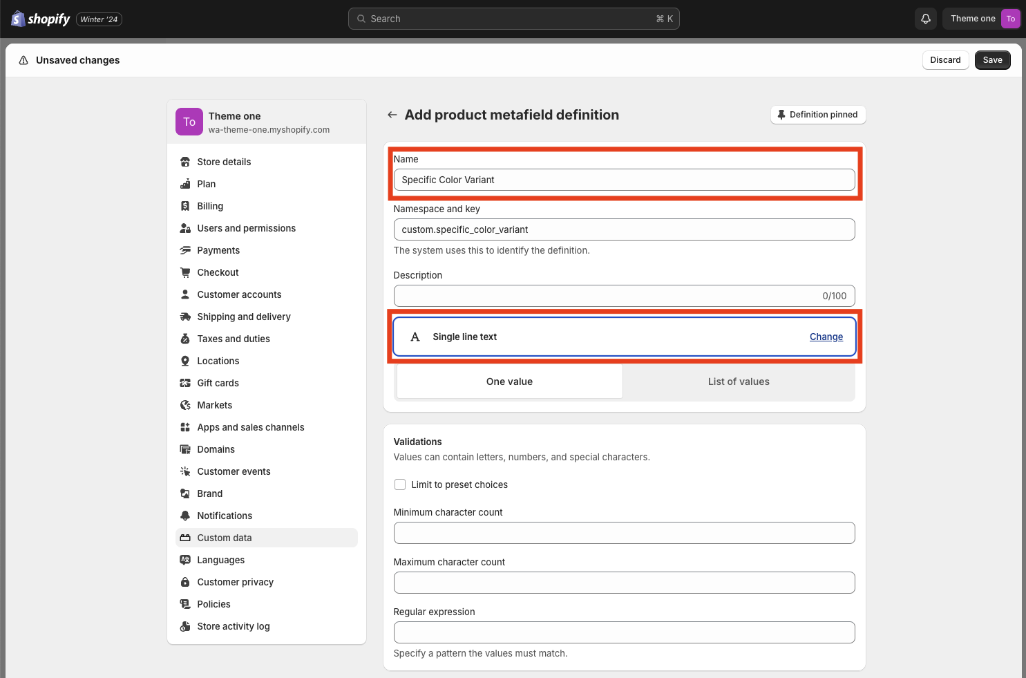
And then tap Save at the top right of the page.
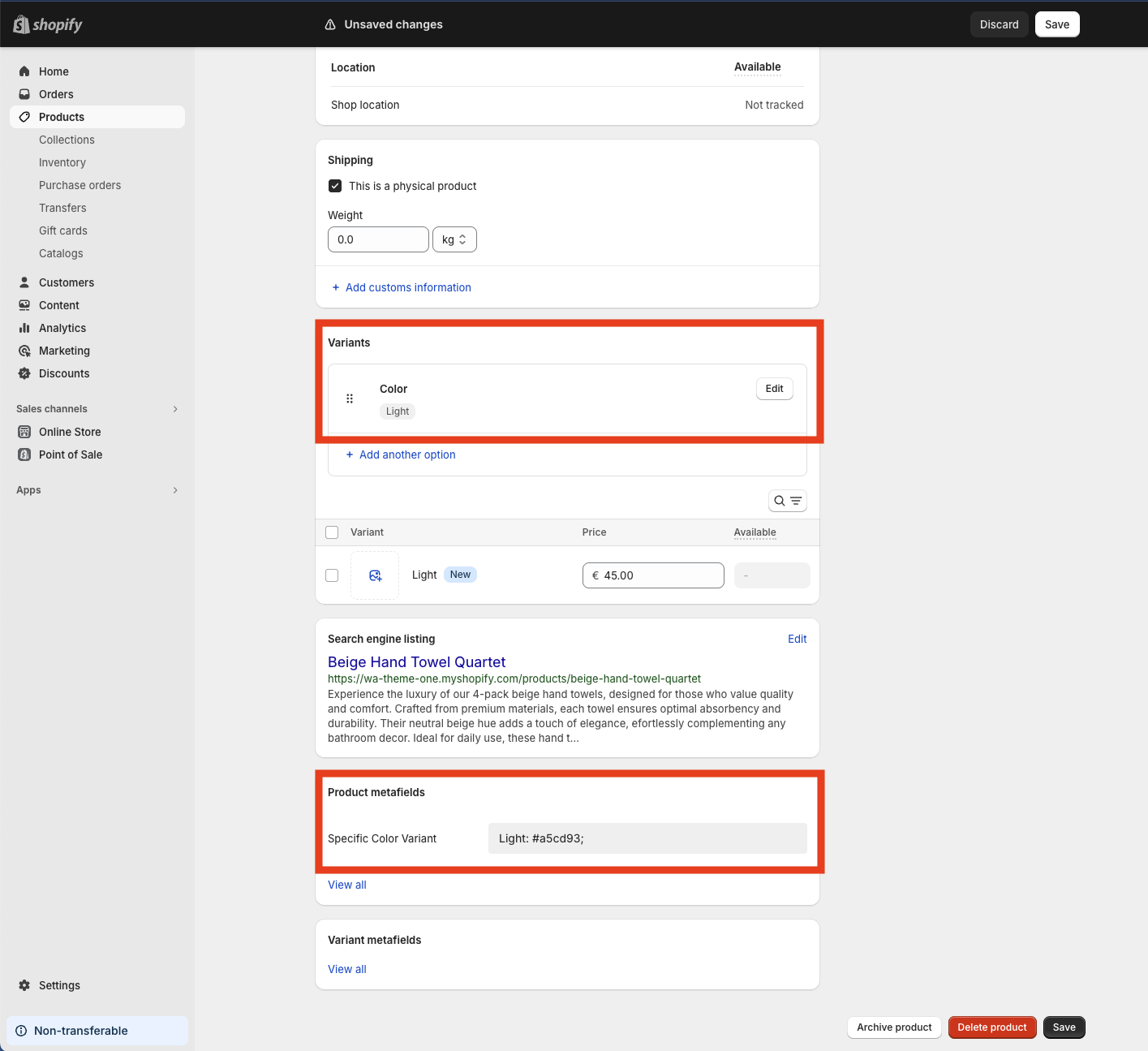
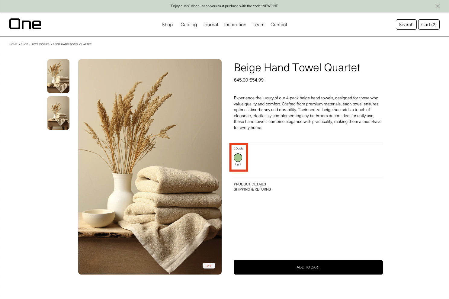
You can now close the Settings and go to the product you want to add a different color Light variant. You need to add the variant Color at the Variants section and put the Light option. Then, at the bottom of the page you will see the Product metafields section and inside there the Specific Color Variant that we just created. Now you need to tap the gray box and write the color with the same format that we used in the Hexadecimal color box:
Light: #a5cd93;
In this example we have chosen a light green instead of the light brown defined for all products.
Then you can Save and go to the theme editor > Product > Variants and inside the Hexadecimal color box tap the top right icon and then add the Specific Color Variant metafield.
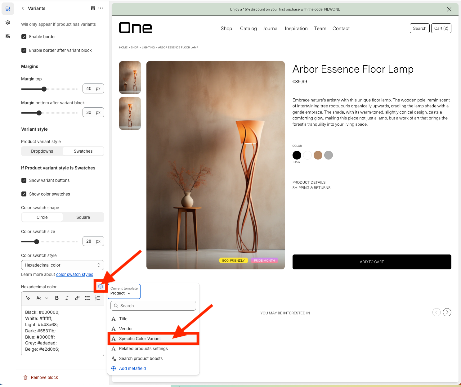
Then you can Save and if you go to the product page you will see that it has the Light color variant but with the green color.
Custom Tags
Tagging your products is a great way to categorize them and make them stand out. You will find the Tag settings in Theme settings > Product Grid > Tags.
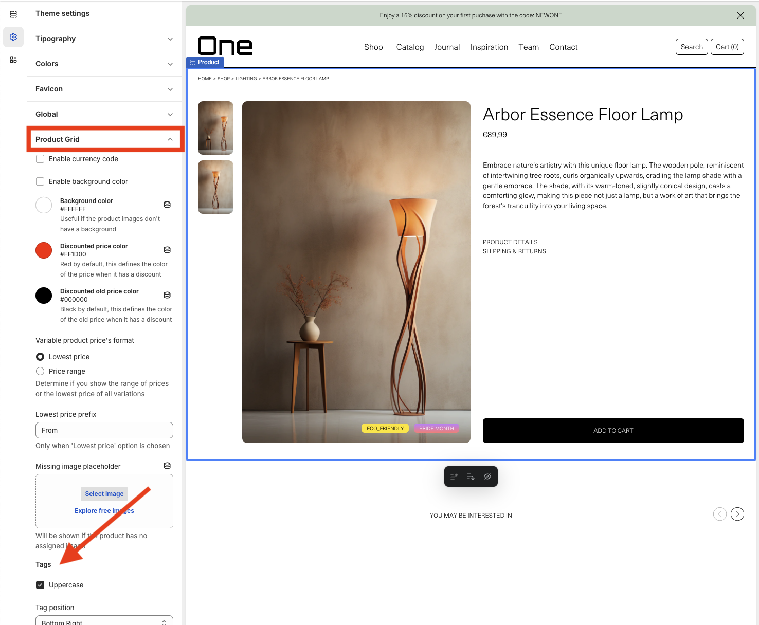
From there, you can modify three aspects:
1. Display them in uppercase > Uppercase
2. Tag position: allows you to define its position. In this example, they are located at Bottom Right, but they can also be positioned at any of the four corners of the gallery.
3. Color: a list appears with all the available colors to customize the tags. Those that start with “TEXT -” will be colors that can be assigned to the text, and the rest will be colors for the background of the tag. For each type (text and background), there is a Default and a Discount color, which can be modified by clicking on them and selecting a new color through a color picker or by adding the hexadecimal code directly. The Default will be the color by default when we add any tag, and the Discount will be for the tag that is automatically created when a discount is applied to a product.
Additionally, you can also define 5 more solid colors and 2 with gradients. It’s important to understand that each background color is associated with the text color that has the same name, and vice versa. Thus, the background called “Color 2” will always be associated with “TEXT – Color 2”, and so on.
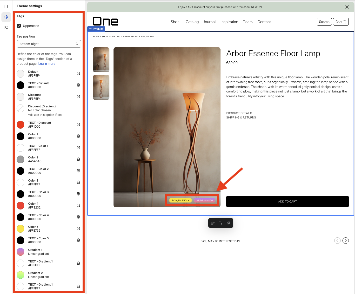
To add and customize the tags of a product, you need to exit the theme editor, go to the Products section, select the desired product, and on the sidebar go to Product organization > Tags.
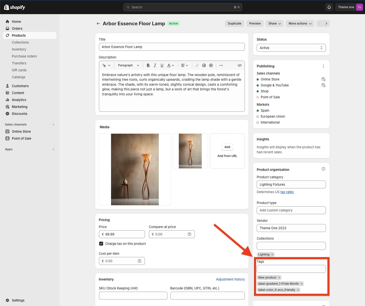
It is recommended to have this page open in one tab and Theme settings > Product Grid > Tags in another to be able to see all the available colors. Thus, within the Tags section of the product page, you can add as many tags as necessary. To apply one of the custom colors or gradients, follow the following nomenclature:
label-color_x-tagname
If we look at the example tag label-gradient_1-Pride Month, we can identify 3 parts always separated by a hyphen “-“:
1. “label” is the first part and is always necessary.
2. “gradient_1” refers to the background color “Gradient 1” and the text color “TEXT – Gradient 1”. As seen, it must always be written in lowercase and with an underscore in between.
3. “Pride Month” is the name we want the tag to have. You can assign any name you want, but keep in mind that hyphens “-” are not supported!
If you do not apply the structure label-color_x-tagname and write only the name of the tag, for example, “New Product”, the Default colors will be used.
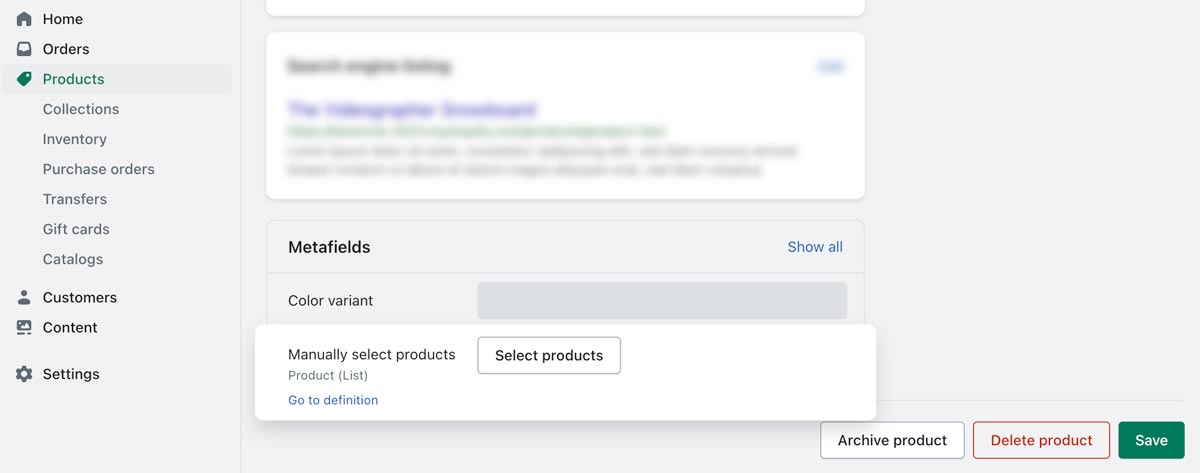
Custom Related Products
If you wish to manually assign related products to a specific product, you’ll find a Metafield option in the product’s configuration page.
Here you’ll be shown a list of all the products in your shop, where you can select the desired products to relate to the current product.
You’ll find the Metafields section at the bottom of the product’s configuration page.
Blog
This section serves as a comprehensive resource for setting up various types of blog archives to enhance your store’s engagement and visibility. Below, we detail the customizable aspects of your blog that can help you tailor content to your audience’s needs.
Default blog
The Default blog template, in this case used in the Journal page, provides a simple and clean template to display your posts. There are some aspects that can be configured using the side bar:
- Post per page
- Posts per row
- Text alignment (selected in this example)
- Title uppercase
- Tags uppercase
- Larger horizontal images (selected in this example)
- Show author
- Show tags
- Show published date
- Section animation (Fade-in selected in this example)
- Custom CSS if needed
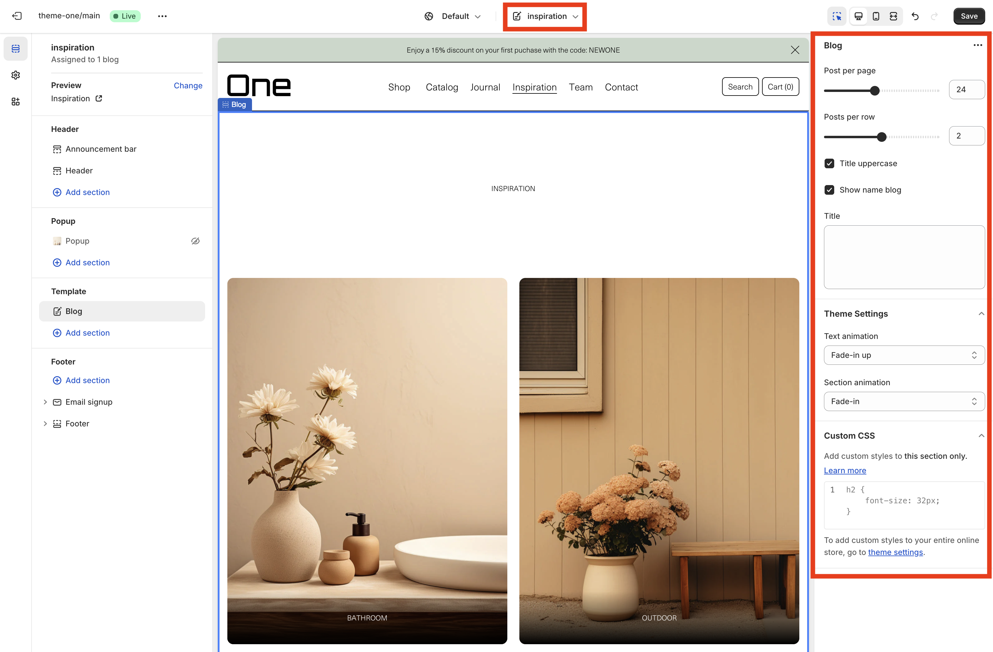
Inspiration
The Inspiration template, in this case used in the Inspiration page, provides a minimalist template to display Inspiration posts. There are some aspects that can be configured using the side bar:
- Post per page
- Posts per row
- Title uppercase (selected in this example)
- Show name blog (selected in this example)
- Title
- Text animation (Fade-in up selected in this example)
- Section animation (Fade-in selected in this example)
- Custom CSS if needed
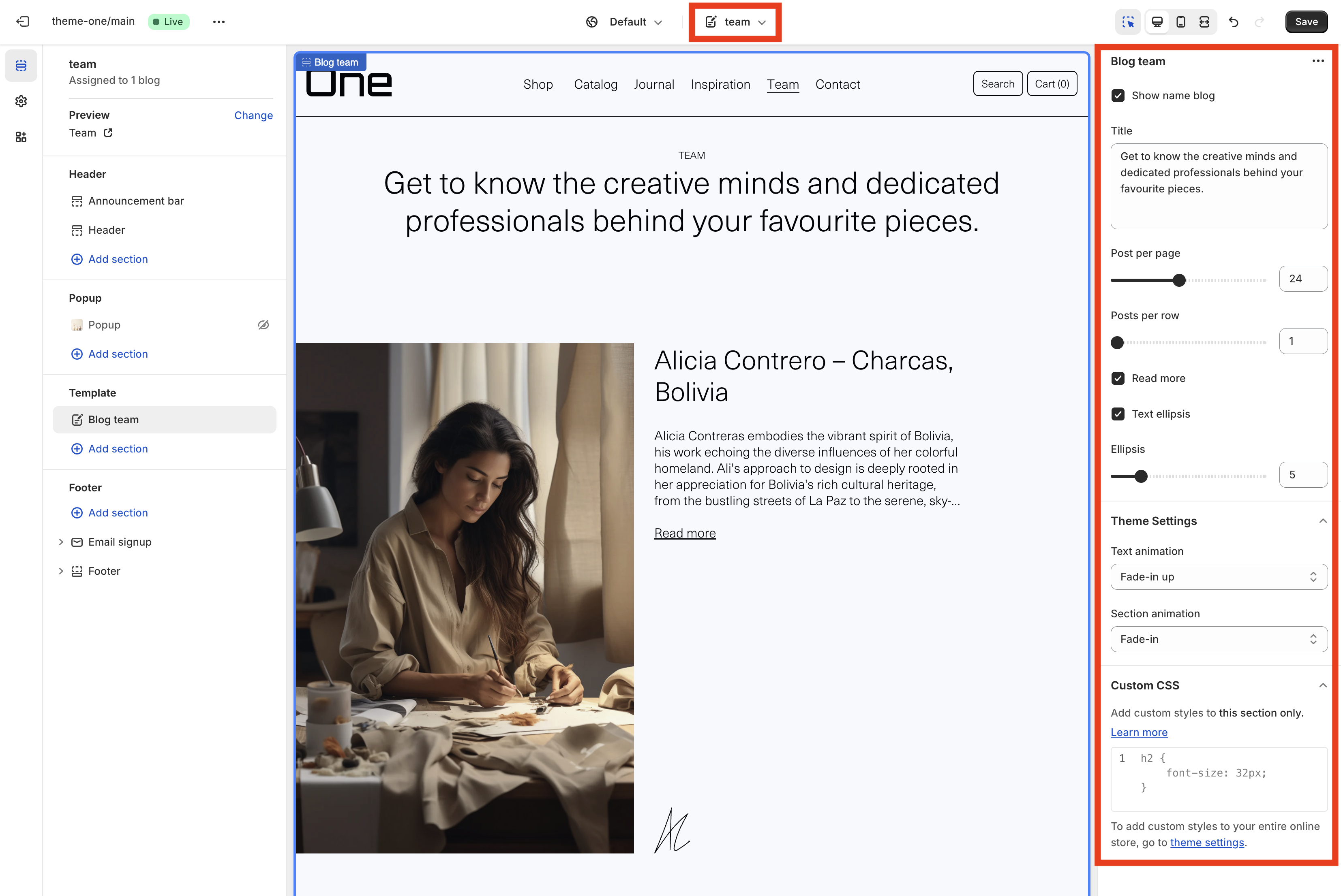
Team
The Team template, in this case used in the Team page, provides a simple template to display the members of your team. There are some aspects that can be configured using the side bar:
- Show name blog
- Title (customized in this example)
- Post per page
- Posts per row
- Read more (selected in this example)
- Text ellipsis (selected in this example)
- Ellipsis
- Text animation (Fade-in up selected in this example)
- Section animation (Fade-in selected in this example)
- Custom CSS if needed
Blog post
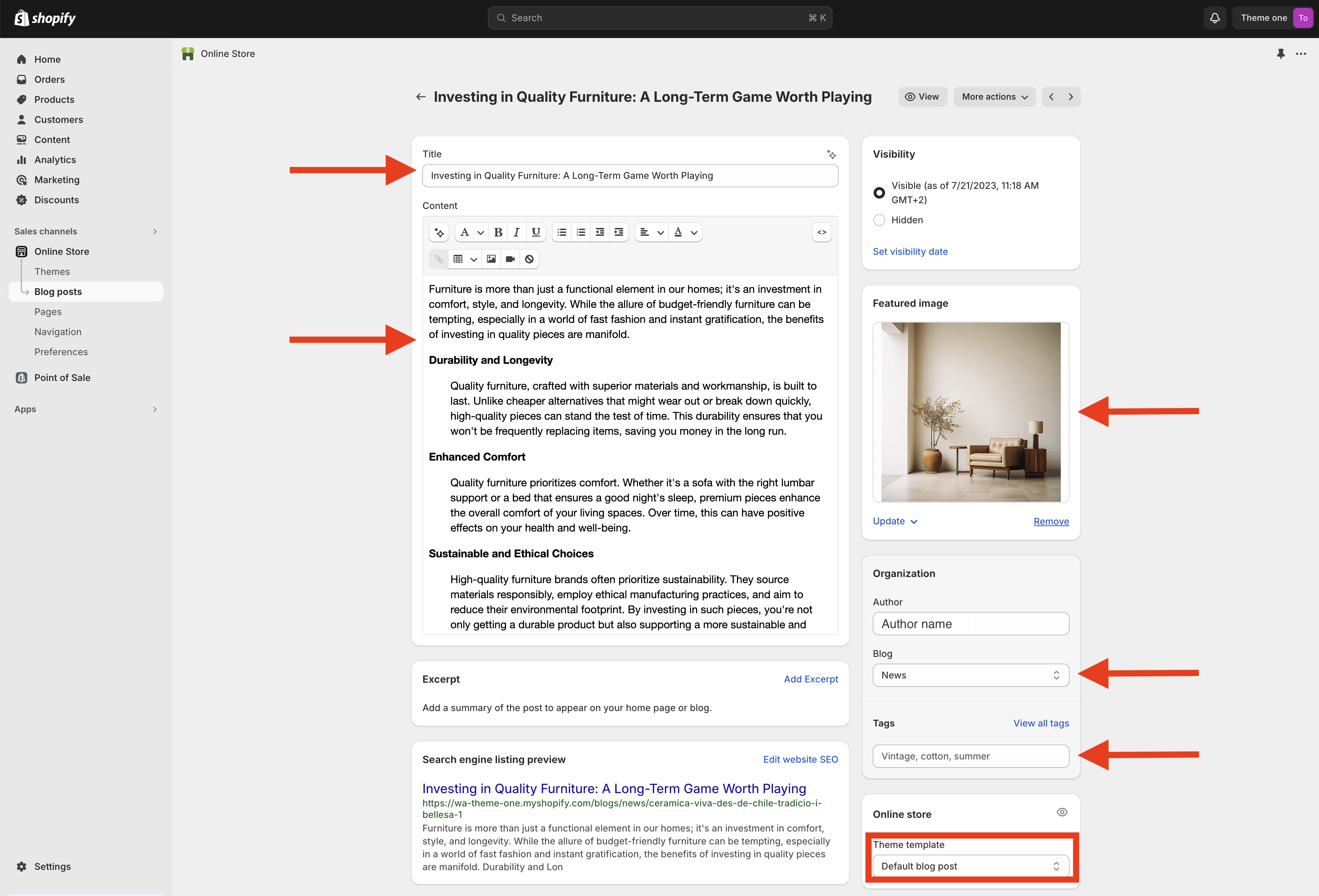
You can create blog posts directly from the main Shopify page by selecting Online Store > Blog Posts. All your blog posts will be listed there, and you can create a new one by clicking the button located in the top right corner.

New blog post
Remember that you can create a new blog post by clicking the button located in the top right corner above the list of blog posts.
The essential elements of a blog post are:
- Title
- Content
- Featured image
- Blog type (in this example is News, corresponding with the Journal blog, but it could also be Inspiration and Team)
- Tags (must be separated with commas)
All posts use the Default blog post template.
When all these sections are completed remember to tap the Save button.
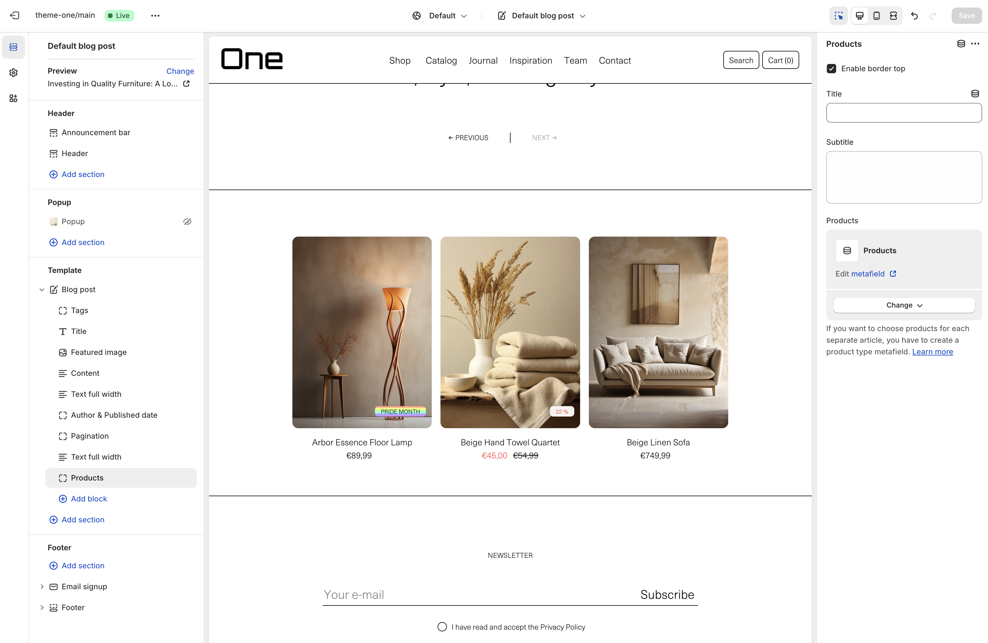
You can add extra content, like text or products, to a specific post using metafields. To do this you must go to Settings > Custom data > Blog posts
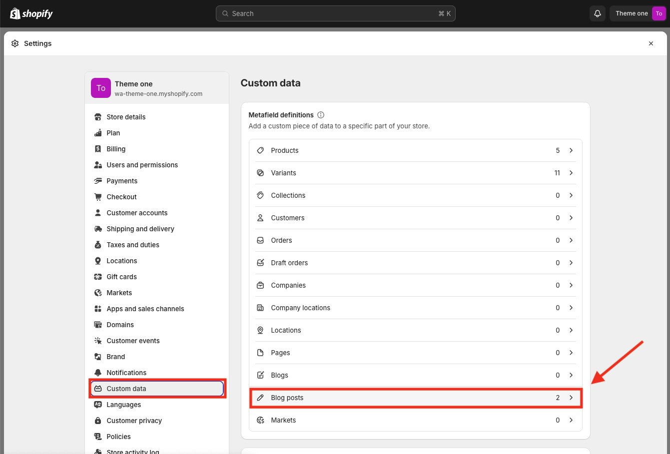
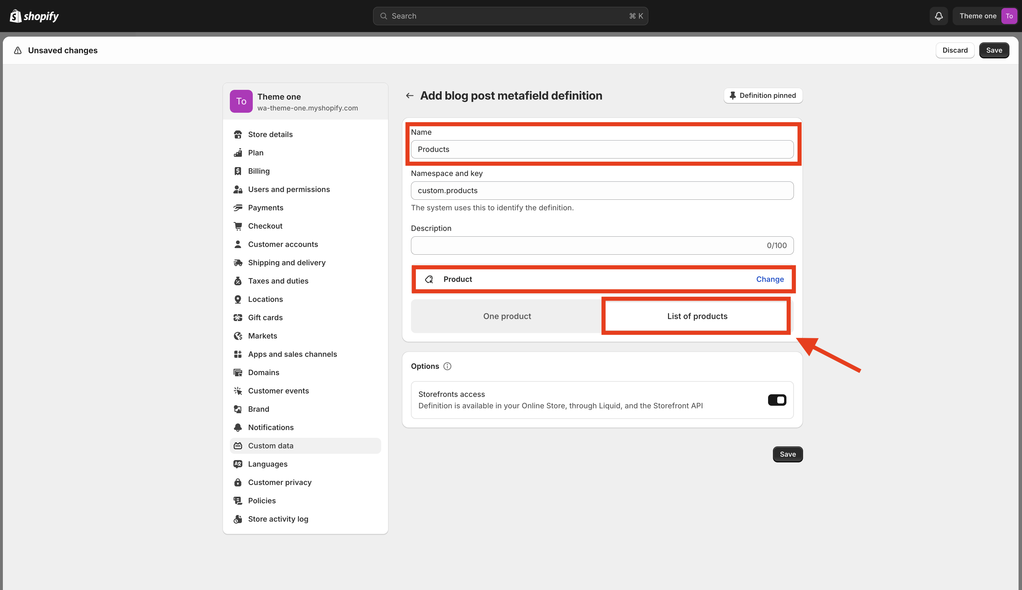
Oncethere, click the Add definition button located in the top right corner. You’ll need to provide a name for the metafield and you can add a description if you wish. Next, select the type of metafield you need; for example, if you choose Product, make sure to select the List of products option, even if you intend to display only one product.
Now, you can return to the blog post page, and at the bottom, you’ll find options to manage the metafields.
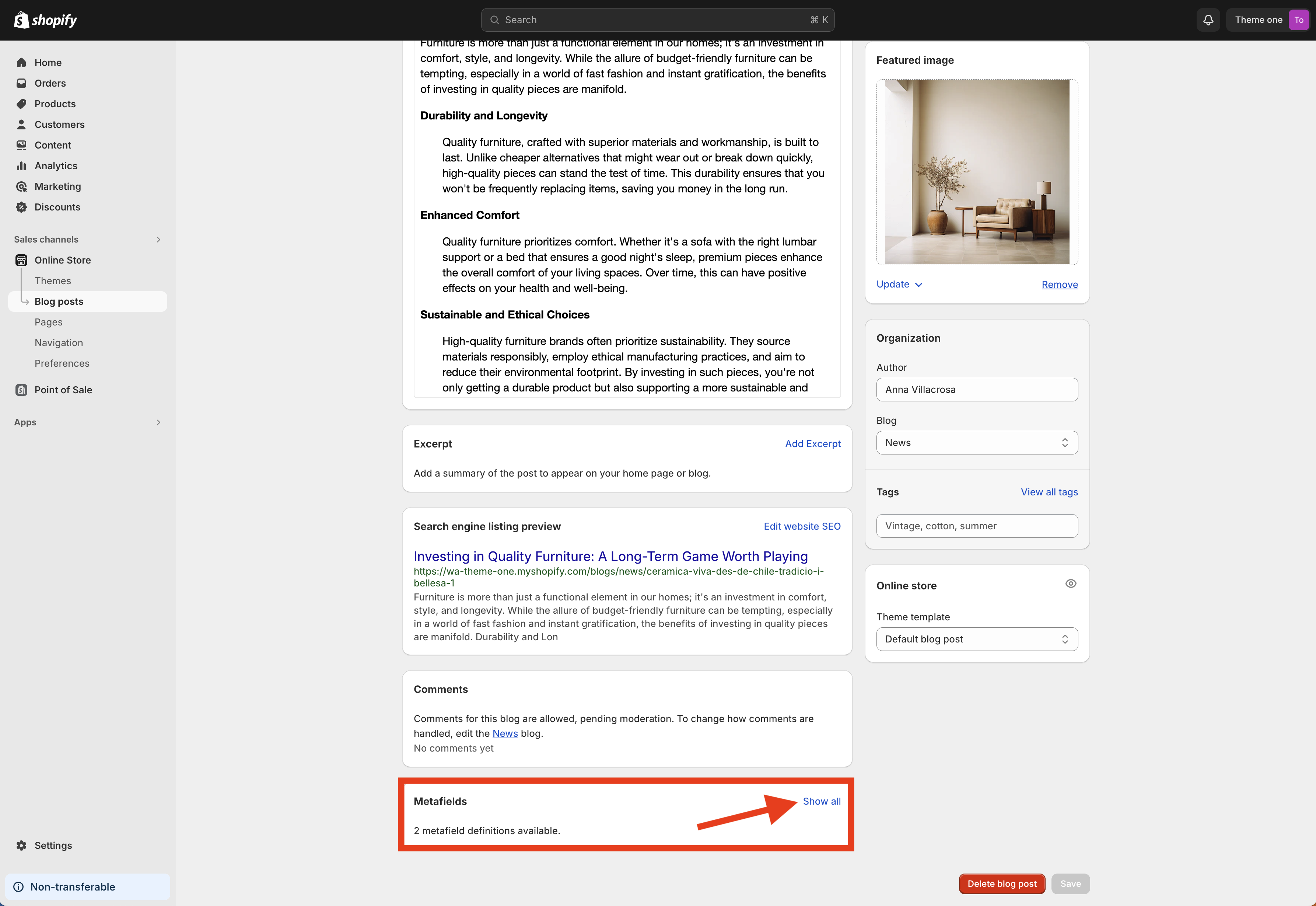
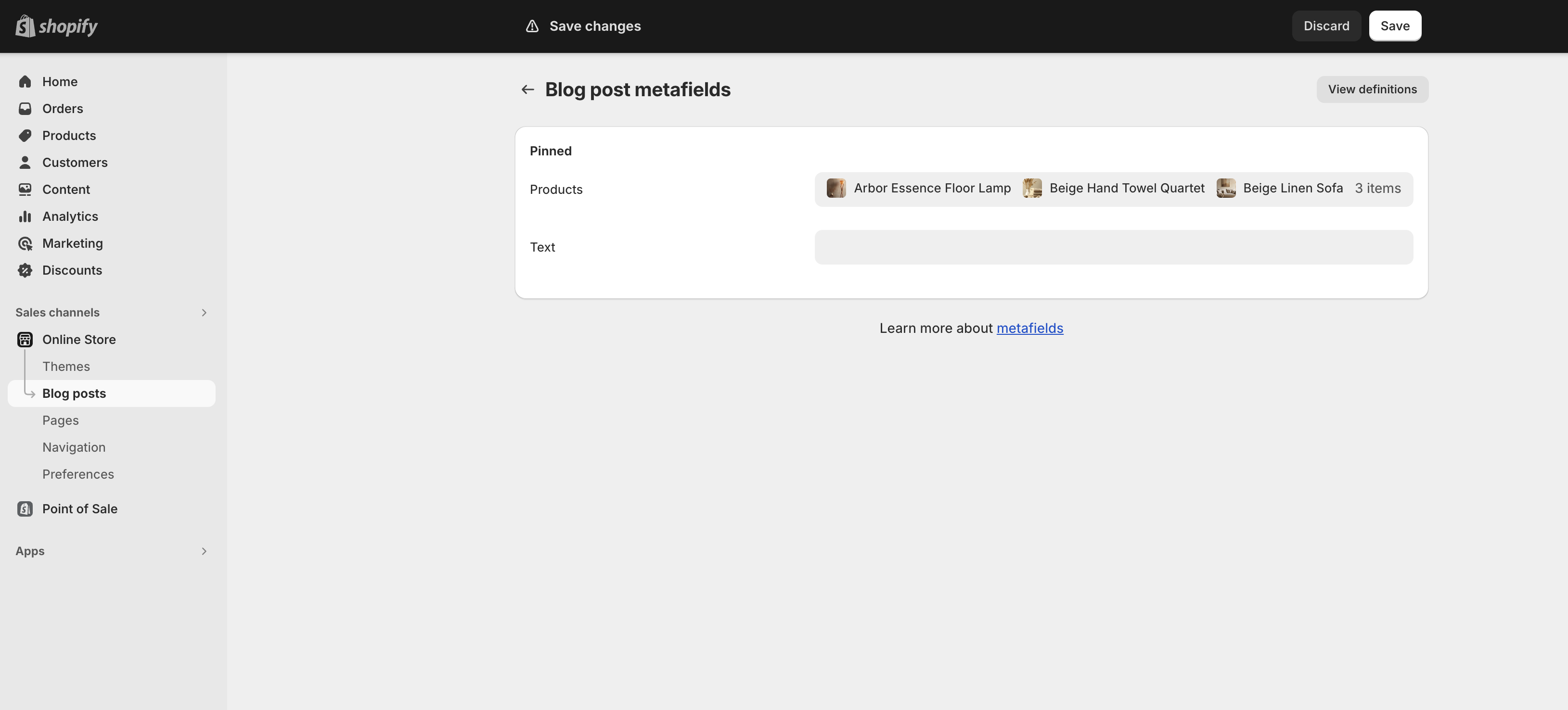
There, you will see the metafields that are available. You can add content as needed, such as a list of products.
Then, when customizing the blog post page, you can add a Products section. To link the metafield, simply click the icon and select the appropriate metafield from the list.
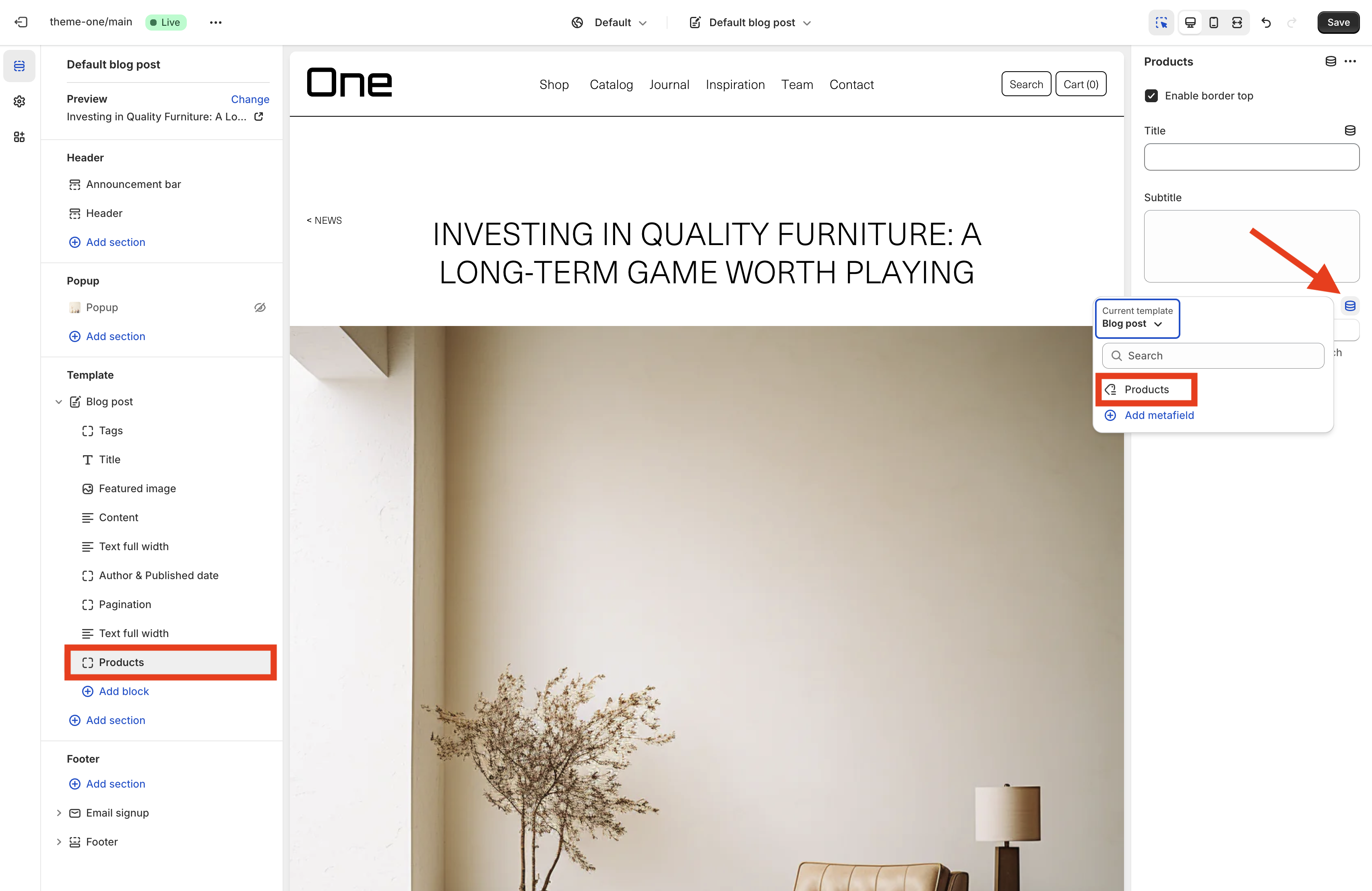
This action will create a section that displays the products you specified for that particular blog post, effectively linking the content with relevant items.
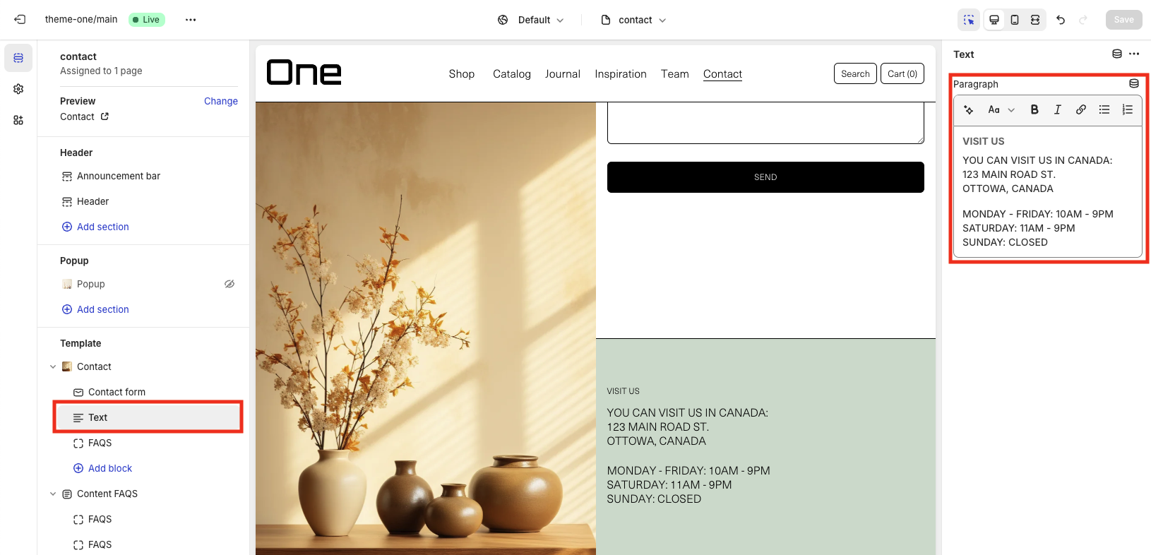
Contact
The contact page template allows your customers to reach out directly with questions, concerns, or feedback. It provides an opportunity for personalized customer service, enhancing their overall experience with your brand.
The contact template contains a contact block with a featured image that you can choose.
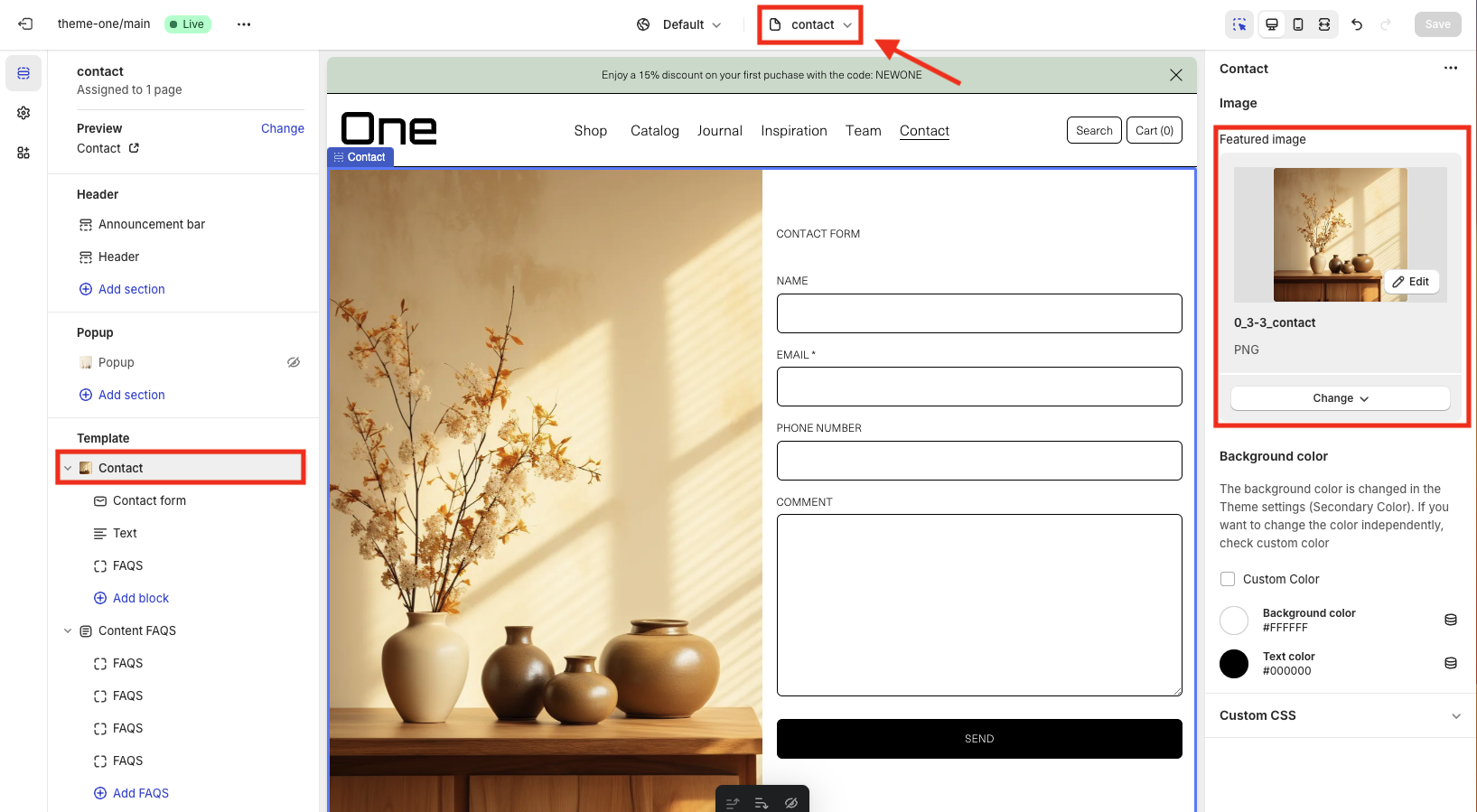
You can also add a contact form and some text that you can customize, for example to add your address.
Collection
The collection template shows all your products, letting customers easily look through different types. This setup helps display all your items clearly and makes it easy to find what they need. Plus, it makes shopping more fun and can help you sell more.
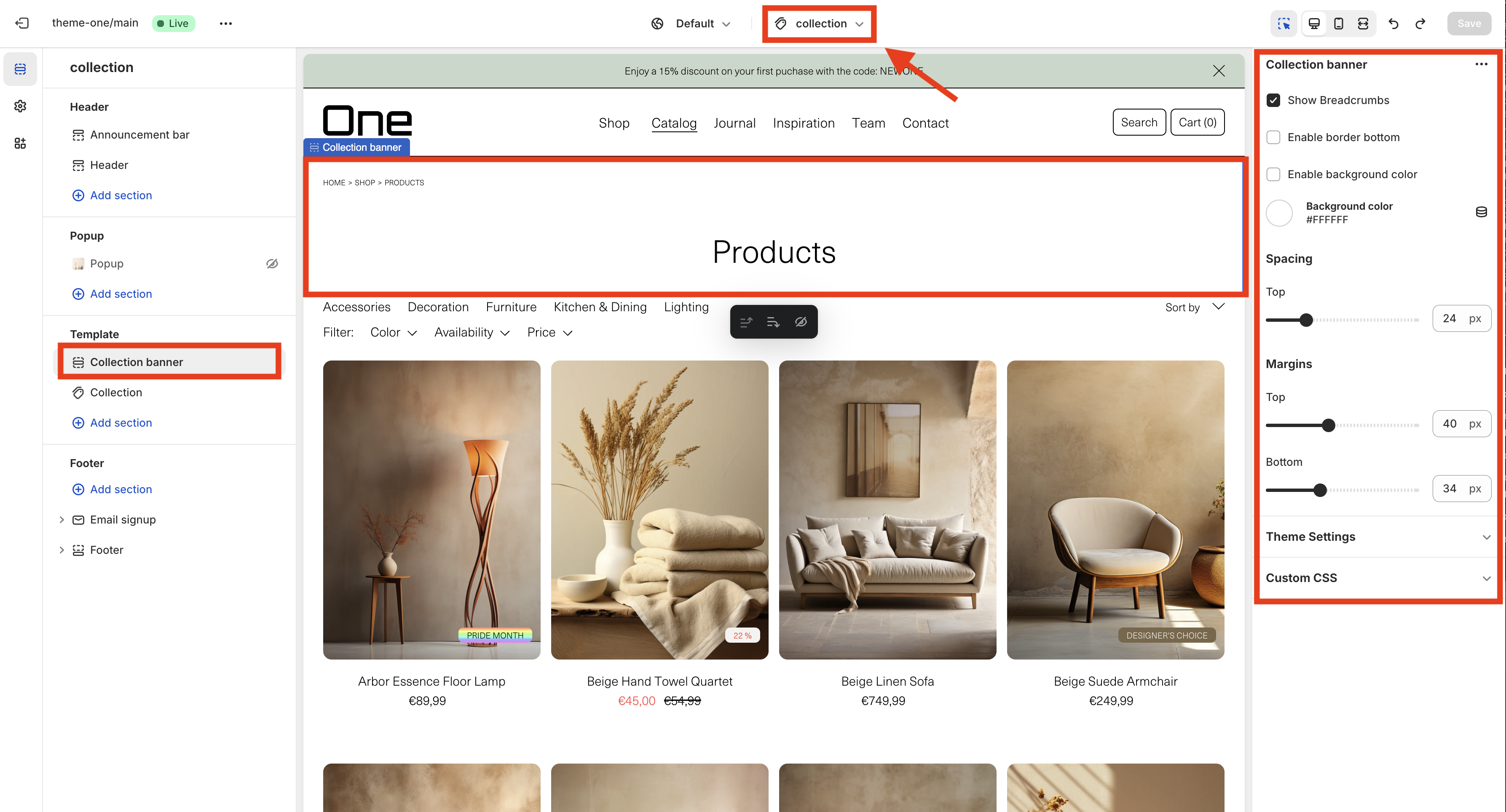
The template includes a Collection Banner section where you can showcase details about the collection. It prominently displays the collection’s title (in this example, “Products”) and offers options to add breadcrumbs, a bottom border, and change the background color. Additionally, you can customize the spacing and margins to suit your design needs.
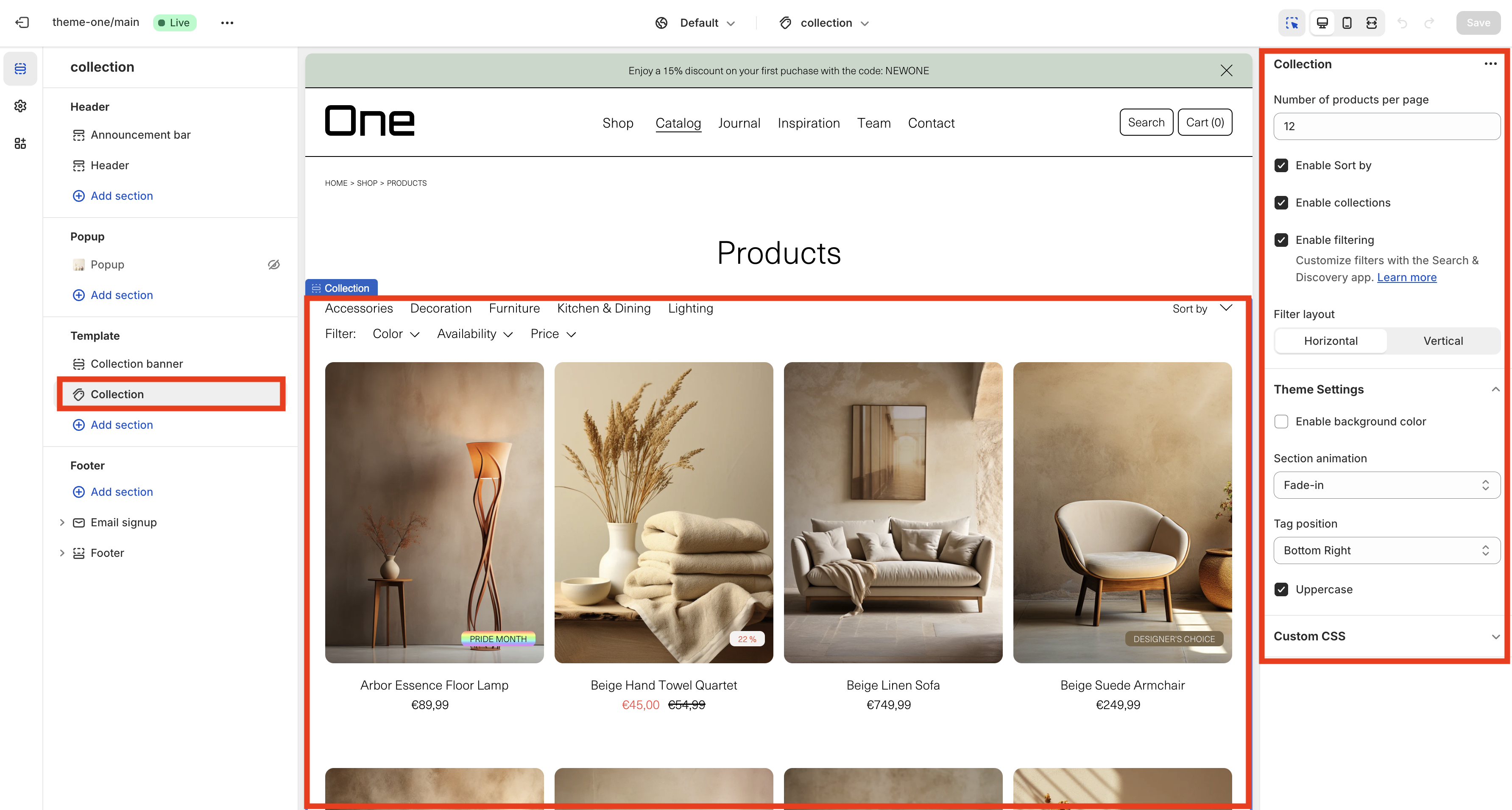
The “Collection” section is where all the products are shown. You can also customize this area using the sidebar options. Here, you can set how many products appear per page and turn on various features like:
- Sorting products
- Displaying collections
- Filtering products
Additionally, you can choose between a horizontal or vertical layout for the filters, add a background color, select an animation for the section, and decide where to place the tags.
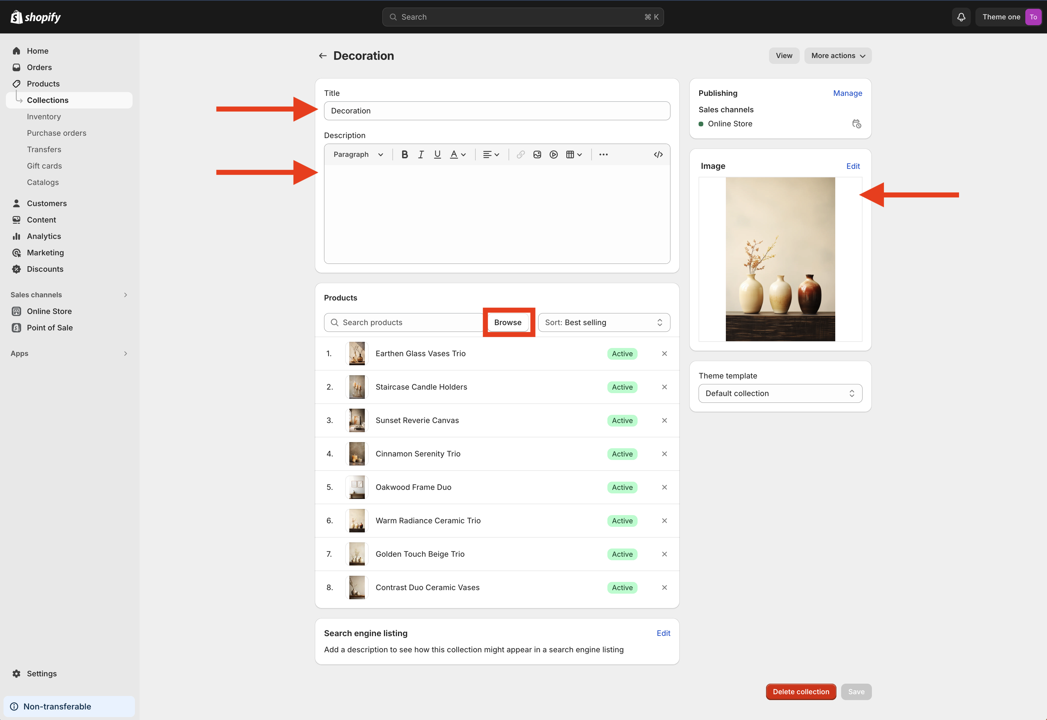
New collection
You can create new product collections by navigating to Products > Collections in the menu and clicking on the Create collection button, which is located at the top right of the page.
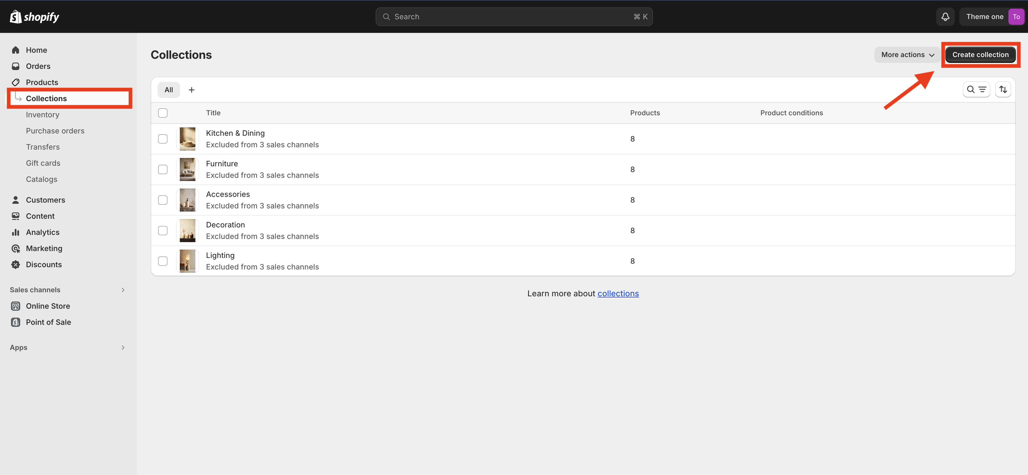
You can name your collection, add a description (optional), select an image, and add products to the collection by clicking the Browse button. Finally, don’t forget to click the Save button to apply your changes.